
Scroll through any social media feed and one thing becomes obvious: most graphics are forgettable. They blend into the background, get skipped over, and never earn a second glance. But every so often, a visual stops you cold—and you’re not entirely sure why.
That’s not an accident. The social media graphics that capture attention are the result of deliberate design decisions: smart use of color, typography, hierarchy, and composition. And the good news? You don’t need a degree in digital graphic design to create them. You need the right principles, a clear process, and an understanding of what makes the human eye pay attention.
This guide breaks all of that down. Whether you’re designing for Instagram, LinkedIn, Facebook, or TikTok, you’ll walk away with a practical framework for creating social media graphics that get noticed—and remembered.
Why Most Social Media Graphics Fail to Get Noticed
The average person sees thousands of pieces of content every day. Attention is the scarcest resource on the internet, and most graphics fail to earn it for the same handful of reasons.
They’re cluttered. They use too many fonts. They rely on colors that clash or, worse, blend into the platform’s background. They don’t have a clear visual focal point, so the eye doesn’t know where to look. And they’re often generic—recycled templates that have been seen so many times they’ve lost all impact.
Understanding these pitfalls is the first step. From there, it’s about building good visual habits from the ground up.
The Core Principles of Effective Visual Design for Social Media
 Before diving into tactics, it helps to understand the underlying principles that govern all strong visual design. These aren’t arbitrary rules—they’re grounded in how humans perceive and process images.
Visual Hierarchy: Guide the Eye with Intention
Visual hierarchy is the practice of organizing design elements so that viewers naturally look at the most important parts first. It’s one of the most critical concepts in both audio visual design and digital graphic design.
Size, color, contrast, and positioning all influence hierarchy. A bold headline at the top of a graphic draws the eye before anything else. A brightly colored call-to-action button stands out against a muted background. A face looking toward a piece of text will naturally lead the viewer’s gaze in that direction.
When designing social media graphics, ask yourself: what do I want people to notice first? Second? Third? Then design accordingly. If everything is equally prominent, nothing is.
The Power of Contrast
Contrast is what makes elements pop. High contrast between text and background makes content readable at a glance—critical when someone is scrolling at speed. Low contrast, by contrast, creates confusion and causes viewers to move on.
Contrast applies to more than color. Size contrast (a large headline next to smaller body text), shape contrast (a circular element among rectangular ones), and tonal contrast all work together to create graphics that feel dynamic and intentional.
White Space Is Not Wasted Space
Designers who are new to social media graphics often feel the urge to fill every pixel. Resist it. White space—also called negative space—gives design room to breathe. It reduces cognitive load, draws attention to what matters, and signals a level of confidence in the design.
Some of the most striking social media graphics are ones that use minimal elements, carefully spaced. Less truly is more.
Consistency Builds Brand Recognition
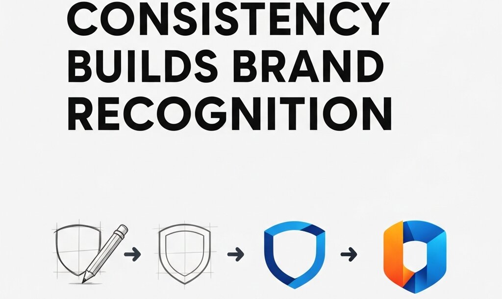 Consistent use of color, fonts, and layout across your social media graphics does something powerful: it trains audiences to recognize your content before they even read it. Over time, that recognition builds trust.
Create a simple style guide for your brand’s social media visuals—even just two or three core colors, one or two fonts, and a preferred layout structure. Then stick to it.
Choosing the Right Colors for Social Media Graphics
Color is one of the first things viewers register—before text, before layout, sometimes before subject matter. It sets the tone and communicates emotion instantly.
A few principles to guide your color decisions:
Limit your palette: Two or three colors per graphic is usually enough. A primary color for key elements, a secondary color for accents, and a neutral for backgrounds or text. More than that risks visual chaos.
Consider platform context: Facebook’s dominant color is blue, Instagram skews toward warm tones and high saturation, LinkedIn favors professional navy and gray palettes. This doesn’t mean you have to match the platform—sometimes standing out means going in the opposite direction—but it’s worth knowing what you’re working against.
Use color to direct attention: Bright, saturated colors draw the eye. If your call-to-action needs to stand out, make it the most vivid element on the screen. Everything else should support it, not compete with it.
Understand color associations: Color psychology is a well-documented area of visual design. Blue conveys trust and calm. Red signals urgency or energy. Green is associated with health, nature, and growth. Yellow communicates optimism. These associations aren’t universal across cultures, but they’re a useful starting point.
Typography: Why Font Choices Make or Break Your Graphics
Typography is often underestimated in social media graphic design. But a poorly chosen font—or too many fonts—can undermine an otherwise strong design instantly.
Stick to Two Fonts Maximum
Using more than two typefaces in a single graphic creates visual noise. A common and effective approach is pairing a bold display font for headlines with a clean, readable sans-serif for body text or captions. This contrast creates hierarchy while keeping things cohesive.
Resources like Google Fonts and Adobe Fonts offer hundreds of free, high-quality options. Visual design books such as Thinking with Type by Ellen Lupton are also excellent references for building typographic literacy.
Prioritize Readability Over Style
A highly stylized script font might look beautiful in a logo, but it’s often impossible to read at small sizes or on a busy background. Social media graphics are consumed quickly and often on mobile screens—clarity always wins.
Test your text at the size it will actually appear. If you need to squint to read it, so will your audience.
Type Size and Weight Create Emphasis
Big, bold text commands attention. Lighter, smaller text recedes. Use this to your advantage by making your most important message the largest element on the graphic, and letting supporting details sit quietly beneath it.
How to Compose Social Media Graphics That Feel Professional
Composition refers to how elements are arranged within the frame. Strong composition makes a graphic feel balanced, intentional, and easy to look at. Weak composition creates confusion and visual tension.
The Rule of Thirds
One of the most widely used composition techniques in both photography and digital graphic design is the rule of thirds. Divide your canvas into a 3×3 grid and place key elements along the gridlines or at their intersections. This creates a more dynamic, engaging layout than simply centering everything.
Most design tools—including Canva, Adobe Express, and Figma—offer grid overlays to help with this.
Alignment Creates Order
Misaligned elements make a graphic feel sloppy, even if viewers can’t explain why. Use consistent alignment—left, center, or right—for text and design elements, and make sure everything lines up to an underlying grid.
Use Focal Points Strategically
Every strong social media graphic has a focal point: the single element that everything else supports. It could be a product image, a bold headline, or a person’s face. Without a focal point, the eye wanders and the message gets lost.
Strip your graphic back to its most essential element. Build outward from there.
Platform-Specific Design Considerations
 Social media graphics don’t exist in a vacuum—they live on specific platforms, each with their own dimensions, audience expectations, and scrolling behaviors.
Instagram rewards high-quality visuals, strong aesthetics, and consistent grid appearance. Square (1080×1080px) and portrait (1080×1350px) formats perform well in the feed. Stories and Reels favor vertical formats (1080×1920px).
LinkedIn is a professional environment where clean, minimal design tends to perform better than highly stylized visuals. Document carousels and infographic-style posts drive strong engagement.
Facebook supports a wide range of formats, but posts with minimal text on images tend to reach wider audiences due to the platform’s historical (and evolving) ad policies.
Pinterest is a vertical-first platform where tall graphics (2:3 ratio) dominate. Rich imagery, clear typography, and SEO-savvy text overlays perform well.
X (formerly Twitter) favors clean, high-contrast visuals that communicate quickly. Landscape images (16:9) are standard.
Designing with the platform in mind—rather than repurposing a single graphic everywhere—will dramatically improve your results.
Tools and Resources for Designing Better Social Media Graphics
You don’t need expensive software to design professional-quality social media graphics. A few tools that have become industry staples:
- Canva – A browser-based design platform with thousands of templates, ideal for those without formal design training.
- Adobe Express – Adobe’s simplified design tool, great for quick social content and brand consistency.
- Figma – A professional design tool widely used in product and visual design, now increasingly popular among social media designers.
- Adobe Photoshop and Illustrator – Industry-standard tools for more advanced graphic design work.
For those who want to deepen their design knowledge beyond tools, visual design books like The Elements of Typographic Style by Robert Bringhurst and Universal Principles of Design by William Lidwell offer foundational knowledge that will elevate your work across the board.
Start Designing Social Media Graphics That Actually Work
Good social media graphic design comes down to a few non-negotiables: clear hierarchy, intentional color, readable typography, and purposeful composition. Master these, and your graphics will stand out—not because they’re louder than everything else, but because they’re clearer.
Start by auditing your existing social media graphics. Look at them objectively. Is there a clear focal point? Is the text readable at a glance? Does the color palette feel cohesive? Identify the biggest gap and address it first.


Leave a Reply