

Most marketing banners get ignored. Not because the offer is bad, but because the design fails to stop the scroll in the first place. A well-crafted banner can be the difference between a campaign that converts and one that burns your budget. Get it wrong, and even the most compelling message goes unseen.
Banner design sits at the intersection of UI/UX visual design and marketing strategy. It’s a discipline that demands more than just aesthetic sensibility—it requires a clear understanding of user behavior, brand consistency, and the specific platform your banner will live on. Whether you’re designing for a Google Display Network campaign, a social media ad, or a website hero section, the same fundamental principles apply.
This post breaks down everything you need to know about effective banner design for digital marketing. From the core elements of a high-performing banner to platform-specific considerations and common mistakes to avoid, you’ll walk away with a practical framework you can apply to your next campaign.
What Makes a Banner Design Actually Work?
Before diving into tactics, it’s worth understanding what separates a banner that performs from one that doesn’t. High-performing banners share a few key traits: they communicate a single, clear message; they’re visually distinctive without being cluttered; and they give the viewer an obvious reason to act.
The challenge is balancing all of these elements within a constrained space. Banners are small, the attention span of your audience is even smaller, and you’re often competing with dozens of other visual stimuli on the same screen. Every design decision—color, typography, imagery, layout—needs to earn its place.
The Role of Visual Hierarchy in Banner Design
 Visual hierarchy is the backbone of effective banner design. It’s the principle that guides the viewer’s eye through the banner in a deliberate sequence—typically from the most important element to the least. Without it, a viewer’s eye wanders, and the message gets lost.
In practice, this means establishing a clear priority order for your banner’s elements. Your headline or value proposition should command the most visual weight. Your call-to-action (CTA) should be immediately identifiable. Supporting details—like a logo or product image—should complement, not compete with, these primary elements.
Size, contrast, and placement are your main tools here. A bold headline in a large font will naturally draw the eye before a smaller tagline. A high-contrast CTA button stands out against a muted background. Strategic use of white space prevents the design from feeling crowded and gives key elements room to breathe.
How to Choose Colors That Convert
Color is one of the most powerful levers in marketing visual design. The right palette can create an immediate emotional response, reinforce brand recognition, and even influence purchasing decisions.
Start with your brand’s established color palette. Consistency across touchpoints builds trust and recognition—a viewer who sees your banner should instinctively connect it to your brand before they’ve even read the text. From there, think about contrast. Your CTA button, in particular, should contrast sharply with the background so it pops rather than blends in.
Be mindful of cultural context, too. Colors carry different associations across regions and cultures. While red conveys urgency and excitement in many Western markets, it holds different connotations in parts of Asia. If you’re running international campaigns, adapt your palette accordingly.
A practical approach is to limit your banner to two or three primary colors. Too many colors create visual noise and dilute the impact of your most important elements.
Typography: Small Space, Big Impact
Typography in banner design is less about beauty and more about legibility. Your audience will typically see your banner for a fraction of a second—your font choices need to make your message readable at a glance.
Stick to one or two typefaces. A strong, bold sans-serif works well for headlines because it’s easy to read at a distance and across different screen sizes. Use weight variations—bold for headlines, regular for body copy—to create contrast without introducing a second font.
Font size matters more than most designers anticipate. Test your designs at actual display sizes, not just in your design tool. A headline that looks perfect at 100% zoom may become unreadable when the banner is rendered at its actual dimensions on a website or mobile screen.
Kerning and line spacing also deserve attention. Tight letter spacing can make text feel cramped, while overly wide spacing can disrupt readability. Aim for comfortable, natural spacing that doesn’t draw attention to itself.
Crafting a CTA That Gets Clicked
 Your call-to-action is the whole point of the banner. Every other design decision should support and amplify it. Yet CTAs are often an afterthought—slapped on at the end in a standard button style with generic copy like “Click Here” or “Learn More.” Effective CTA design has two components: copy and presentation.
On the copy side, specificity wins. “Get Your Free Quote” outperforms “Learn More.” “Shop the Sale” beats “Click Here.” The more clearly you communicate what happens when someone clicks, the more likely they are to do it.
On the presentation side, your CTA button should be visually distinct from everything else in the banner. Use a contrasting color, ensure it’s large enough to click comfortably on mobile, and give it adequate padding so it doesn’t feel cramped. Rounded corners tend to feel more clickable than sharp edges—a small detail, but one that adds up.
Platform-Specific Considerations for Banner Design
One of the most common mistakes in digital marketing is treating banner design as a one-size-fits-all exercise. The reality is that each platform has its own specifications, audience behavior, and performance norms.
Designing Banners for Google Display Network
Google Display Network (GDN) banners appear across millions of websites, which means your design needs to work in a wide range of contexts. GDN supports a variety of standard ad sizes, but the top performers are typically the 300×250 medium rectangle, the 728×90 leaderboard, and the 160×600 wide skyscraper.
For GDN, simplicity is paramount. These banners appear alongside editorial content, so a clean, uncluttered design is more likely to stand out than a busy one. Use your brand colors prominently to build recognition across repeat exposures, and keep your copy concise—one headline, one supporting line, one CTA.
Designing Social Media Graphics for Paid Campaigns
Social media graphics for paid campaigns operate in a much more dynamic environment. Users are scrolling quickly through feeds filled with content from friends, creators, and other brands. Your banner has less than two seconds to earn attention.
On platforms like Facebook and Instagram, video and motion graphics consistently outperform static banners. If you’re working with static images, lead with a striking visual—a bold color, a human face, or an unexpected composition—before any text. Keep text minimal, as platforms like Facebook historically penalize ad reach for text-heavy images.
LinkedIn banners, on the other hand, benefit from a more professional aesthetic. Data-driven headlines, clean layouts, and a more restrained use of color tend to perform well with a business audience.
Designing for Website and Email Banner Placement
Banners embedded in websites or email campaigns have a slightly more captive audience, but they still compete for attention. For website banners, ensure your design is responsive—it should look equally strong on desktop and mobile without requiring separate assets.
Email banners present unique constraints. Many email clients block images by default, which means your banner may never render for a portion of your audience. Always include descriptive alt text, and avoid banners where the critical message exists only in the image rather than in the accompanying email copy.
Common Banner Design Mistakes to Avoid
Even experienced designers fall into predictable traps. Here are the most common ones—and how to sidestep them.
Overloading the design with information: Banners are not brochures. If you’re trying to communicate more than one main idea, you need more than one banner. Focus each design on a single message and a single action.
Ignoring file size and load times: A beautiful banner that takes three seconds to load will go unseen. Optimize your image files for web delivery without sacrificing visual quality. For display ads, adhere strictly to platform file size limits.
Failing to A/B test: Banner design is not a set-and-forget exercise. Small changes—a different CTA color, an alternate headline, a new image—can produce dramatically different results. Build testing into your workflow from the start.
Neglecting brand consistency: A banner that looks disconnected from your other marketing materials undermines trust and recognition. Maintain consistent use of logos, colors, and typography across all campaign assets.
Designing only for desktop: More than half of web traffic globally comes from mobile devices. If your banner design isn’t optimized for smaller screens, you’re leaving a significant portion of your audience with a poor experience.
How to Measure Banner Design Performance
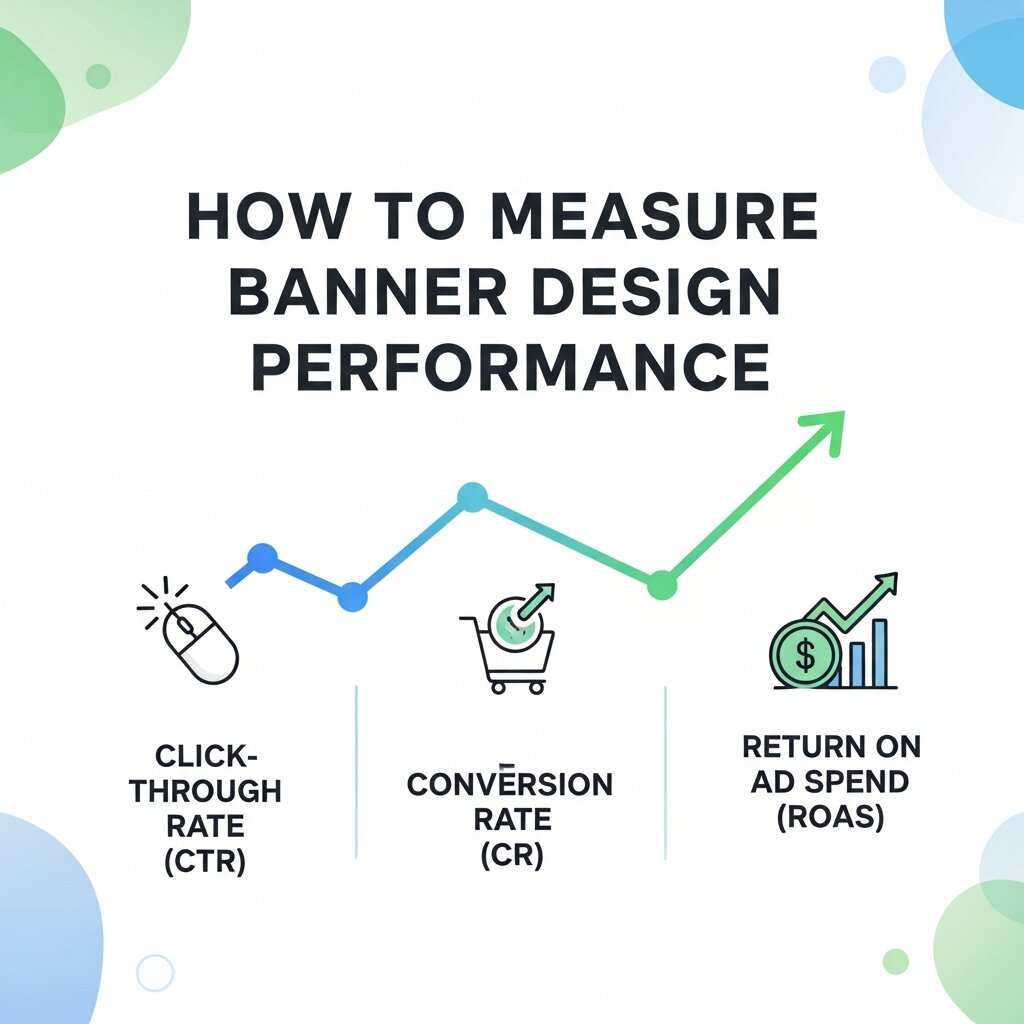 Design decisions should be informed by data, not just intuition. The key metrics to track for banner campaigns include click-through rate (CTR), conversion rate, impressions, and cost-per-click (CPC).
CTR tells you how compelling your banner is at generating interest. A low CTR usually indicates a design or messaging problem—the banner isn’t resonating enough to prompt action. Conversion rate, on the other hand, tells you what happens after the click. If CTR is strong but conversion is low, the issue may lie in the landing page rather than the banner itself.
Use these metrics to guide iterative improvement. Run A/B tests on individual design elements, document what works, and build a library of high-performing design patterns you can draw on for future campaigns.
Building a Banner Design System That Scales
As your digital marketing grows in scope, producing banners manually for every campaign becomes unsustainable. A well-designed banner system—a set of templates, components, and guidelines—allows your team to produce on-brand, high-quality banners at scale without starting from scratch each time.
A solid banner design system includes a defined set of approved layouts for each standard ad size, a restricted color palette and typography system, a library of approved imagery and iconography, and clear rules around logo placement and CTA styling.
Tools like Figma, Adobe XD, and Canva for Teams all support template-based workflows that make this kind of systematic production practical, even for smaller marketing teams.
Optimizing Banner Design for Mobile Users
With mobile devices generating the majority of online traffic, every banner should be designed with smaller screens in mind. Mobile-friendly banners use concise messaging, larger typography, and touch-friendly call-to-action buttons that remain easy to tap on any device. Visual elements should be simplified to prevent clutter while maintaining strong brand recognition. Responsive layouts ensure banners display correctly across different screen sizes without losing important information. Designers should also test banners on multiple devices before launching a campaign to verify readability and usability. A mobile-first approach not only improves the user experience but also increases engagement, click-through rates, and conversions across digital advertising platforms.
Using Brand Consistency to Strengthen Banner Performance
Strong branding helps audiences recognize and trust your business, making consistency an essential part of banner design. Every banner should reflect the same visual identity through logos, colors, typography, imagery, and messaging. Consistent branding reinforces credibility across websites, social media, email campaigns, and display advertisements while creating a cohesive customer experience. Even when promoting different products or services, maintaining recognizable design elements strengthens long-term brand recall. Businesses should establish clear brand guidelines to ensure every designer follows the same standards. Over time, this consistency improves campaign effectiveness because customers become familiar with the visual style and associate it with your products or services.
Frequently Asked Questions (FAQs)
1. What is banner design in digital marketing?
Banner design is the process of creating visually appealing promotional graphics for websites, display ads, social media, email campaigns, and other digital platforms. Its goal is to capture attention, communicate a clear message, and encourage users to take a specific action, such as clicking a link or making a purchase.
2. Why is visual hierarchy important in banner design?
Visual hierarchy helps viewers quickly understand the most important information by guiding their eyes from the headline to the supporting content and finally the call-to-action. A clear hierarchy improves readability, engagement, and overall campaign performance.
3. What are the key elements of an effective marketing banner?
An effective marketing banner typically includes a compelling headline, high-quality visuals, consistent branding, readable typography, a strong call-to-action (CTA), and enough white space to keep the design clean and easy to understand.
4. Which colors work best for banner advertisements?
The best colors depend on your brand identity and campaign goals. High-contrast color combinations improve visibility, while consistent brand colors build recognition. Limiting the design to two or three primary colors often creates a cleaner and more impactful banner.
5. What is the ideal size for digital banner ads?
Banner sizes vary by platform. Popular Google Display Network sizes include 300×250, 728×90, and 160×600 pixels. Social media platforms and websites also have recommended dimensions, so designers should always follow the specifications of each platform.
6. How can I improve my banner’s click-through rate (CTR)?
Improve CTR by using a clear value proposition, eye-catching visuals, a strong CTA, concise copy, and optimized color contrast. Regular A/B testing of headlines, images, and CTA buttons can also reveal which design elements generate the best results.
7. Should banner designs be optimized for mobile devices?
Yes. Since most users browse on smartphones, banners should be mobile-friendly with larger text, simplified layouts, responsive designs, and touch-friendly CTA buttons. Testing on multiple screen sizes helps ensure a consistent user experience.
8. What are the most common banner design mistakes?
Common mistakes include overcrowding the design with too much text, using low-contrast colors, ignoring mobile optimization, inconsistent branding, poor-quality images, weak CTAs, and failing to test different design variations before launching campaigns.
9. How do I measure the success of a banner advertising campaign?
Success is typically measured using metrics such as click-through rate (CTR), conversion rate, impressions, cost-per-click (CPC), return on ad spend (ROAS), and overall engagement. Analyzing these metrics helps identify opportunities for continuous design improvements.
10. Which design tools are best for creating professional banner ads?
Popular banner design tools include Adobe Illustrator, Adobe Photoshop, Figma, Canva, and Adobe XD. These platforms offer templates, design components, and collaboration features that help create consistent, high-quality banners for digital marketing campaigns.
Turn Good Design Into a Competitive Advantage
Banner design is one of those disciplines where incremental improvements compound over time. A slightly higher CTR means more traffic from the same ad spend. Better conversion rates mean more leads from the same number of clicks. Small gains in visual design translate directly into measurable business outcomes.
The brands that win at digital marketing aren’t necessarily those with the biggest budgets—they’re the ones that take design seriously as a performance lever. By applying the principles of strong visual hierarchy, purposeful color and typography choices, platform-aware design, and data-driven iteration, you can build banner campaigns that genuinely move the needle. Start with one campaign. Apply these principles. Measure the results. Then refine.



Leave a Reply