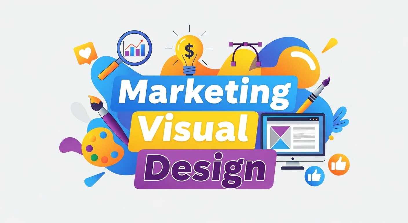
Think about the last ad that stopped your scroll. Chances are, it wasn’t the copy that caught your eye first—it was the color, the layout, the image, or the way everything fit together. That split-second reaction is the power of marketing visual design at work.
In digital marketing, you have seconds (sometimes milliseconds) to grab attention. Strong visuals don’t just make your content look pretty; they shape how people feel about your brand, how well they understand your message, and whether they take action. Poor design does the opposite. It confuses, distracts, and sends potential customers clicking away.
This post breaks down the role marketing visual design plays in digital marketing success. You’ll learn why visuals matter so much, the core principles that separate good design from great design, and practical ways to use design to boost engagement, build trust, and drive conversions. By the end, you’ll see your marketing visuals as a strategic asset—not an afterthought.
What Is Marketing Visual Design?
Marketing visual design is the practice of using visual elements—color, typography, imagery, layout, and graphics—to communicate a brand’s message and persuade an audience to act. It covers everything from social media graphics and email templates to landing pages, infographics, and digital ads.
Unlike pure graphic design, marketing visual design always serves a business goal. A beautiful image that doesn’t drive clicks, sign-ups, or sales has missed the point. Every design choice—from the placement of a button to the font of a headline—should push the viewer one step closer to converting.
It’s also worth distinguishing marketing visual design from related fields. Audio visual design blends sound and visuals for experiences like video and presentations, while marketing visual design tends to focus on the still and interactive graphics that fill our screens. Both matter, but the latter does the heavy lifting across most digital channels.
Why Visual Design Matters in Digital Marketing
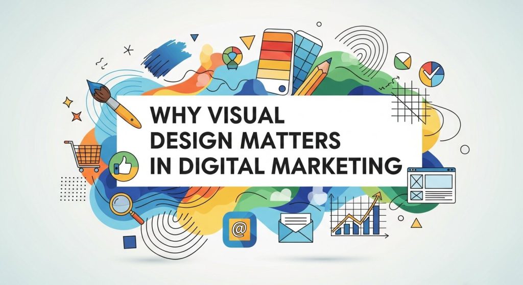 Humans are wired for visuals. We process images far faster than text, and we remember them longer. That makes visual design one of the most powerful tools in any marketer’s kit. Here’s where it makes the biggest difference.
First Impressions Happen Fast
People form an opinion about a website in about 50 milliseconds. That’s barely enough time to read a single word, which means your visuals carry the weight of that first judgment. Clean layouts, balanced color, and clear imagery signal professionalism and trust. Cluttered or outdated design signals the opposite.
Visuals Boost Engagement
Content with relevant images gets significantly more views and shares than text-only content. On social media, posts with strong visuals stop the scroll and earn more likes, comments, and saves. Video and graphics consistently outperform plain text across nearly every platform.
Design Builds Brand Recognition
Consistent visual design—the same colors, fonts, and style across every touchpoint—helps people recognize your brand instantly. Think of the brands you can identify from a single color or shape. That recognition builds over time, and it starts with disciplined, cohesive design.
Good Design Drives Conversions
A well-designed landing page guides the eye toward the action you want people to take. Strategic use of contrast, white space, and visual hierarchy can lift conversion rates dramatically. The difference between a page that converts and one that doesn’t often comes down to design decisions, not just the offer itself.
Core Principles of Effective Marketing Visual Design
Great design isn’t an accident. It follows principles that have been refined over decades. Master these, and your marketing visuals will work harder for you.
Visual Hierarchy
Visual hierarchy is the arrangement of elements to show their order of importance. The biggest, boldest, or brightest element draws the eye first, then the design guides viewers through the rest of the content in a deliberate order. This principle is the backbone of data visualization hierarchy too—when you present charts or stats, size, color, and position tell people what to look at first and what matters most.
To build a strong hierarchy:
- Make your most important element the largest or most prominent.
- Use color and contrast to highlight key messages and calls to action.
- Group related items together so the eye reads them as a unit.
- Leave breathing room so nothing fights for attention.
Color and Contrast
Color sets the emotional tone of your design. Warm tones can feel energetic and urgent, while cool tones feel calm and trustworthy. Beyond mood, color creates contrast that makes important elements pop. A bright call-to-action button on a muted background is hard to ignore—and that’s exactly the point.
Typography
Typography is more than picking a nice font. The right type choices improve readability, reinforce your brand personality, and create structure. Pair a distinctive headline font with a clean, legible body font, and keep your choices consistent across campaigns.
White Space
White space (or negative space) is the empty area around your elements. It’s not wasted space—it’s a tool. Generous white space makes designs feel premium, improves focus, and helps viewers process information without feeling overwhelmed.
Consistency
Consistency ties everything together. When your visuals follow the same rules across platforms, your brand feels reliable and polished. A style guide that defines your colors, fonts, spacing, and imagery keeps every team member and channel aligned.
How to Apply Marketing Visual Design Across Channels
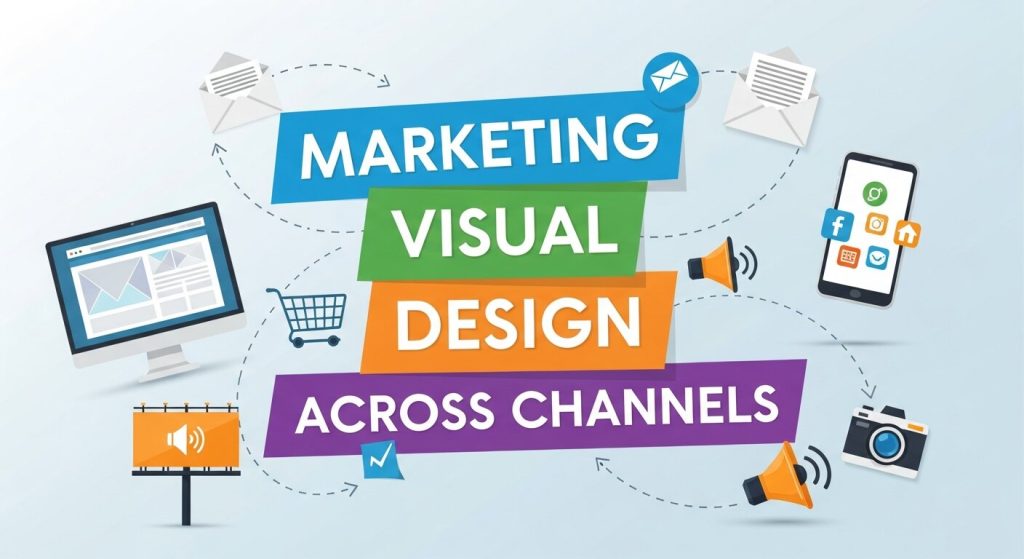 Each digital channel has its own quirks, but the principles of marketing visual design stay the same. Here’s how to put them to work where they matter most.
Social Media
Social platforms are crowded and fast-moving. Your visuals need to stop the scroll instantly. Use bold colors, clear focal points, and minimal text. Keep your style consistent so followers recognize your posts at a glance, and tailor dimensions to each platform’s specs.
Email Marketing
A strong email design balances images and text, uses a clear hierarchy to guide the reader, and makes the call to action impossible to miss. Mobile-first design is essential here, since most people open email on their phones.
Landing Pages
Landing pages are where design directly meets conversion. Remove distractions, use visual hierarchy to lead the eye toward the offer, and make your call-to-action button stand out with color and placement. Every element should support a single goal.
Infographics and Data Visualization
When you’re presenting data, design clarity is everything. Apply data visualization hierarchy to guide readers through complex information—use size and color to emphasize the most important figures, and keep charts clean and uncluttered. A well-designed infographic can turn dry statistics into a shareable, memorable story.
Common Marketing Visual Design Mistakes to Avoid
Even experienced marketers slip up. Watch out for these common pitfalls:
- Cluttered layouts: Trying to say everything at once means nothing stands out. Embrace simplicity.
- Poor contrast: Low contrast between text and background hurts readability and accessibility.
- Inconsistent branding: Mixing styles, colors, and fonts erodes trust and recognition.
- Ignoring mobile: Designs that look great on desktop but break on mobile alienate a huge share of your audience.
- Too much text: Walls of words overwhelm viewers. Let visuals carry part of the load.
How to Keep Improving Your Visual Design Skills
Design is a skill you build over time. The good news is there are plenty of ways to sharpen it.
Start by studying brands you admire and breaking down what makes their visuals work. Follow design communities, save examples that inspire you, and test different approaches in your own campaigns. A/B testing two versions of a graphic or landing page reveals what actually resonates with your audience.
Reading is another reliable path to growth. A few well-chosen visual design books can give you a deep foundation in principles like hierarchy, color theory, and typography. Classics on these topics remain just as relevant today as the day they were written, and they’ll help you make smarter choices instinctively.
Finally, lean on data. Track how your visuals perform—click-through rates, engagement, conversions—and let those numbers guide your next design decisions. The best marketers treat design as a living experiment, not a one-and-done task.
The Role of Motion and Interactive Visuals
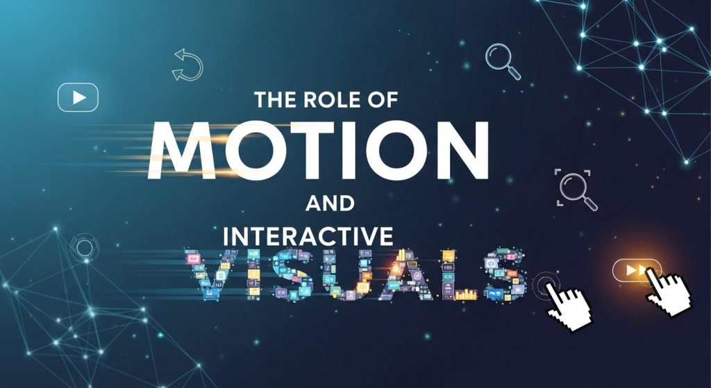 Static design is powerful, but motion adds another layer of impact. Animations, micro-interactions, and short-form videos help guide attention and make content feel more dynamic and engaging. A subtle hover effect on a button or a smooth transition between sections can significantly improve user experience by giving feedback and reducing friction.
In digital marketing, motion visuals are especially effective for storytelling. They can simplify complex ideas, highlight key messages, and keep users engaged longer. When used correctly, motion doesn’t distract—it directs attention exactly where you want it to go, increasing both comprehension and conversions.
Tools and Workflow Behind Effective Visual Design
Strong marketing visual design isn’t just about creativity—it’s also about having the right workflow. Most professionals rely on tools like Figma, Adobe Photoshop, Illustrator, or Canva to create and test visuals efficiently. These tools help teams maintain consistency and speed up production without sacrificing quality.
A good workflow usually starts with strategy, moves into wireframing or sketching, then design execution, and finally testing. Collaboration is key here—designers, marketers, and data teams should work together to ensure every visual serves a clear business goal. When design is structured like a process, not guesswork, results become far more predictable and scalable.
Frequently Asked Questions
1. What is marketing visual design?
Marketing visual design is the use of colors, images, typography, and layouts to communicate a brand’s message. Its goal is to attract attention, improve user experience, and encourage customers to take action.
2. Why is marketing visual design important for digital marketing?
Marketing visual design creates strong first impressions, increases brand recognition, and improves engagement. Effective visuals help audiences understand messages quickly and motivate them to click, subscribe, or purchase products and services.
3. How does visual design influence customer behavior?
Visual design influences emotions and decision-making. Attractive colors, clear layouts, and engaging images build trust, guide attention, and encourage users to interact with content, ultimately increasing conversions and customer satisfaction.
4. What’s the difference between marketing visual design and graphic design?
Graphic design focuses on creating visually appealing artwork, while marketing visual design combines creativity with strategy. Its primary goal is to support business objectives such as increasing traffic, engagement, and sales.
5. What are the main elements of marketing visual design?
The main elements include color, typography, imagery, layout, white space, and visual hierarchy. Together, these components create appealing designs that communicate messages clearly and provide a consistent brand experience.
6. How can marketing visual design improve conversion rates?
Marketing visual design improves conversions by making content easier to understand and navigate. Strong calls to action, strategic layouts, and appealing visuals guide users toward desired actions like purchases, sign-ups, or downloads.
7. Why is consistency important in marketing visual design?
Consistency strengthens brand identity and builds customer trust. Using the same colors, fonts, and design styles across all marketing channels helps audiences recognize your brand and creates a professional, reliable image.
8. How does marketing visual design affect social media performance?
Strong visual design helps social media posts stand out in crowded feeds. Eye-catching graphics and consistent branding increase engagement, improve brand recognition, and encourage users to like, share, comment, and follow.
9. What are common mistakes in marketing visual design?
Common mistakes include cluttered layouts, inconsistent branding, poor color contrast, excessive text, and ignoring mobile users. These issues reduce readability, confuse audiences, and negatively impact engagement and overall marketing performance.
10. How can businesses improve their marketing visual design skills?
Businesses can improve visual design skills by studying successful brands, following design trends, practicing regularly, and analyzing performance data. Continuous learning and testing help create more engaging and effective marketing visuals.
Turn Visual Design Into a Competitive Advantage
Marketing visual design isn’t a finishing touch you add at the end of a campaign. It’s a strategic driver of attention, trust, and conversions across every digital channel. From the first impression on your landing page to the consistency of your social feed, design shapes how people perceive and respond to your brand.
The brands that win online are the ones that treat visual design as central to their strategy. Start by auditing your current visuals against the principles in this post: Is your hierarchy clear? Are your colors and fonts consistent? Does every design choice serve a goal? Make small improvements, measure the results, and keep refining. Your audience—and your conversion rates—will thank you.


Leave a Reply