Numbers alone rarely inspire action. When you present stakeholders with a massive spreadsheet, their eyes often glaze over. The human brain struggles to process raw data in its native, tabular form. We need context, structure, and a clear focal point to make sense of thousands of data points. This is exactly where data visualization graphic design steps in to bridge the gap between complex information and human understanding.
Converting raw numbers into a compelling visual narrative requires a specific set of skills. You are translating abstract figures into shapes, colors, and lines that instantly communicate a specific message. A well-crafted chart or graph can reveal hidden trends, highlight significant anomalies, and guide business decisions in ways that a simple text report never could.
Reading this guide will equip you with a deep understanding of how to merge analytical thinking with creative execution. We will explore the fundamental principles of data visualization and graphic design, examine the tools professionals use, and discuss how to structure your visual information for maximum impact. By mastering these concepts, you will be able to transform dry statistics into persuasive, memorable visual stories that resonate with your audience.
The Intersection of Data and Design
 Data visualization graphic design represents the perfect marriage of science and art. The scientific aspect requires rigorous accuracy, ensuring that the visual representation remains true to the underlying numbers. You cannot distort a scale or manipulate an axis simply because it looks better aesthetically. The artistic side demands an understanding of human perception, layout, and visual flow.
When you look at a successful data visualization, you are seeing a carefully orchestrated arrangement of visual elements. The designer has made hundreds of micro-decisions regarding line weight, color contrast, and white space. These choices work together to guide the viewer’s eye exactly where it needs to go. A skilled designer knows how to strip away the noise and highlight the signal, ensuring the main takeaway is immediately obvious.
Making Sense of Complex Information
We process visual information significantly faster than written text. When we see a line chart moving sharply upward, we instantly understand growth or an increase. When we see a map with varying shades of red, we recognize areas of high concentration or danger. Data visualization graphic design leverages these innate psychological shortcuts.
To achieve this clarity, designers must thoroughly understand the dataset before they even open their design software. You have to ask the right questions about the data. What is the most surprising finding? What is the expected baseline? Who is the intended audience, and what do they already know about this topic? Answering these questions dictates the visual approach, ensuring the final graphic serves its primary communicative purpose.
Graphic Design vs Visual Design in Data
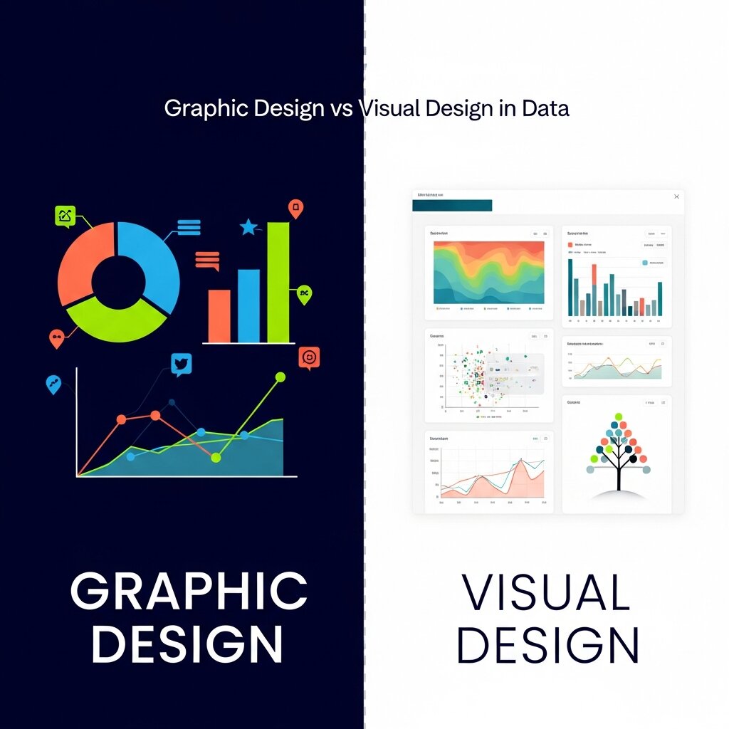 People often use industry terms interchangeably, but understanding the nuances can improve your approach to data projects. The debate of graphic design vs visual design is particularly relevant when building data dashboards and reports. Both disciplines play crucial roles, yet they focus on different aspects of the final product.
Graphic design traditionally focuses on the communication of a specific message. It involves typography, layout, and image creation to convey information effectively. In the context of data, a graphic designer might work on a static infographic for a magazine or an annual report. They ensure the text is readable, the charts are accurate, and the overall composition aligns with the brand’s identity.
Visual design takes a broader view, heavily intersecting with user interface (UI) and user experience (UX) principles. Visual designers focus on the overall look and feel of a product, often in digital and interactive environments. When building a dynamic data dashboard, a visual designer considers how a user will interact with the data. They think about hover states, responsive layouts, and how the visual hierarchy adapts as the user filters different metrics. Understanding the interplay of graphic design vs visual design helps teams create data visualizations that are both beautiful and functionally robust.
Key Principles of Data Visualization Graphic Design
Creating effective visual data requires strict adherence to several foundational design principles. Ignoring these rules often results in confusing, cluttered graphics that frustrate the viewer.
Keep It Simple and Focused
Simplicity is the ultimate goal in data visualization and graphic design. Every element on the canvas must serve a clear purpose. If a gridline, border, or label does not directly aid in understanding the data, remove it. Edward Tufte, a pioneer in the field, refers to this non-essential decoration as “chartjunk.”
Focusing the viewer’s attention means minimizing distractions. Use clean, sans-serif typography for labels and numbers to maximize legibility at small sizes. Avoid 3D effects on flat charts, as they distort the data and make it difficult to compare values accurately. The data itself should always be the loudest element in the composition.
Use Color with Purpose
Color is an incredibly powerful tool for data designers, but it is frequently misused. A common mistake is assigning a rainbow of colors to a chart simply to make it look vibrant. This approach overwhelms the viewer and dilutes the meaning.
Instead, use color strategically to encode information. Use sequential color scales (light to dark) to represent a progression of values, such as population density. Use diverging color scales (two distinct colors blending through a neutral midpoint) to show variations above and below a baseline, like temperature anomalies or profit and loss. Always ensure your color choices maintain high contrast for readability and are accessible to users with color vision deficiencies.
Establish a Clear Hierarchy
Visual hierarchy guides the viewer through the information in a specific, intentional order. The most critical data point or the overarching conclusion should be the most prominent element on the page. You can establish this hierarchy through size, placement, and contrast.
A large, bold headline provides immediate context. The primary chart should occupy the most central space. Supporting metrics, footnotes, and methodological details should be visually subordinate, placed at the bottom or sides in smaller, lighter text. A strong hierarchy prevents the viewer from feeling lost when they first glance at the visualization.
Best Practices for Creating Engaging Charts
The mechanics of building a chart are straightforward, but selecting the right vehicle for your data requires careful consideration. Different datasets and different narratives demand specific visual treatments.
Choose the Right Chart Type
Selecting the appropriate chart type is a fundamental step in data visualization graphic design. Bar charts are excellent for comparing categorical data. Line charts excel at showing trends over time. Scatter plots are ideal for revealing the relationship or correlation between two different variables.
Avoid using pie charts for complex comparisons. Humans are generally poor at accurately judging the relative size of angles and slices. If you have more than three or four categories, a horizontal bar chart is almost always a more effective and readable choice. Matching the chart type to the data’s inherent structure guarantees the most accurate and easily digested presentation.
Tell a Compelling Story
Data storytelling requires more than just plotting points on a graph. You must weave a narrative that gives the numbers meaning. Start by identifying the core message you want the audience to remember. Then, build the visualization around supporting that specific message.
Use annotations directly on the chart to point out key events or sudden changes. If a line graph shows a massive dip in sales in a specific month, add a small text callout explaining the cause. This contextual layer prevents the viewer from having to guess what happened and transforms a simple chart into an informative narrative experience.
Tools for Modern Data Designers
 The software landscape for data visualization and graphic design is vast and continually evolving. The right tool depends entirely on your specific needs, your technical expertise, and the final medium of the graphic.
For complex data analysis and dynamic dashboards, tools like Tableau and Microsoft Power BI remain industry standards. They allow users to connect to massive databases and generate interactive visualizations relatively quickly. However, they sometimes lack the fine-tuned typographic and layout controls required for high-end editorial design.
When pixel-perfect control is necessary, designers turn to vector graphics software like Adobe Illustrator. Often, a designer will generate a basic chart in a specialized data tool, export it as a vector file, and then import it into Illustrator to refine the colors, typography, and layout.
For web-based and collaborative visual design, Figma has become increasingly popular. Its component-based system allows teams to build standardized data visualization libraries, ensuring consistency across large digital products. Code-based libraries like D3.js offer the ultimate level of customization and interactivity, though they require a deep understanding of programming.
Common Mistakes to Avoid in Data Visualization
Even well-intentioned designers can create confusing visuals if they overlook key principles. One of the most common mistakes is overloading a chart with too much information, making it difficult for viewers to identify the main message. Another issue is using misleading scales or truncated axes, which can distort the perception of data trends. Poor color choices, such as low contrast or excessive variation, also reduce readability and accessibility. Additionally, neglecting labels, legends, or context leaves the audience guessing what the data represents. Designers sometimes prioritize aesthetics over accuracy, which undermines trust. Avoiding these pitfalls ensures your visualization remains clear, honest, and effective in communicating insights.
The Importance of Audience-Centered Design
A successful data visualization always considers the needs and knowledge level of its audience. Designing for experts differs greatly from designing for a general audience with limited familiarity with the subject. If your viewers are not data-savvy, overly complex charts or technical jargon can create confusion instead of clarity. Audience-centered design involves simplifying the presentation, using familiar chart types, and providing clear labels or explanations. It also requires anticipating questions your audience may have and addressing them within the visual. By tailoring your design choices to your viewers, you make the information more accessible, engaging, and actionable. Ultimately, the goal is not just to present data but to ensure it is understood.
Future Trends in Data Visualization Graphic Design
The field of data visualization graphic design continues to evolve alongside technology. Interactive and real-time visualizations are becoming more popular, allowing users to explore data dynamically rather than passively viewing static charts. Artificial intelligence is also playing a growing role by helping automate data analysis and suggesting optimal visualization formats. Augmented reality (AR) and virtual reality (VR) are opening new possibilities for immersive data experiences, particularly in fields like healthcare and engineering. Additionally, there is an increasing focus on accessibility, ensuring visualizations are usable for people with disabilities. Staying updated with these trends helps designers remain competitive and create forward-thinking, impactful visual content.
Frequently Asked Questions
What is data visualization graphic design?
Data visualization graphic design is the practice of combining data analysis with visual communication principles. It involves organizing, structuring, and designing numerical information into charts, graphs, and infographics to make complex data easily understandable and visually engaging.
How does color impact data visualization?
Color encodes meaning, highlights key data points, and establishes visual hierarchy. Proper use of color draws attention to critical trends, while poor color choices can confuse the viewer, obscure the data, or create accessibility issues for colorblind users.
What is the difference between graphic design vs visual design?
Graphic design generally focuses on communicating a specific message through typography, imagery, and layout, often for static mediums like print or standalone infographics. Visual design encompasses the broader aesthetics and functionality of a digital product, focusing heavily on user interface, user experience, and how interactive elements behave within a digital environment.
Why is storytelling important in data visualization?
Storytelling provides the necessary context that raw numbers lack. By guiding the viewer through a narrative arc and using annotations to explain anomalies or trends, you make the data relatable, memorable, and actionable for the audience.
Start Crafting Better Data Stories Today
Mastering the intersection of numbers and aesthetics allows you to communicate with profound clarity. The principles of data visualization graphic design serve as a reliable framework for processing complex information and delivering it in a highly digestible format. By focusing on simplicity, intentional color usage, and strict visual hierarchy, you empower your audience to grasp difficult concepts immediately.
Take a close look at the next dataset you need to present. Instead of defaulting to a standard spreadsheet or a generic pie chart, consider the narrative hidden within those numbers. Apply the techniques we have discussed to highlight the most crucial insights. By intentionally designing your data, you elevate your work from simple reporting to true visual storytelling.


Leave a Reply