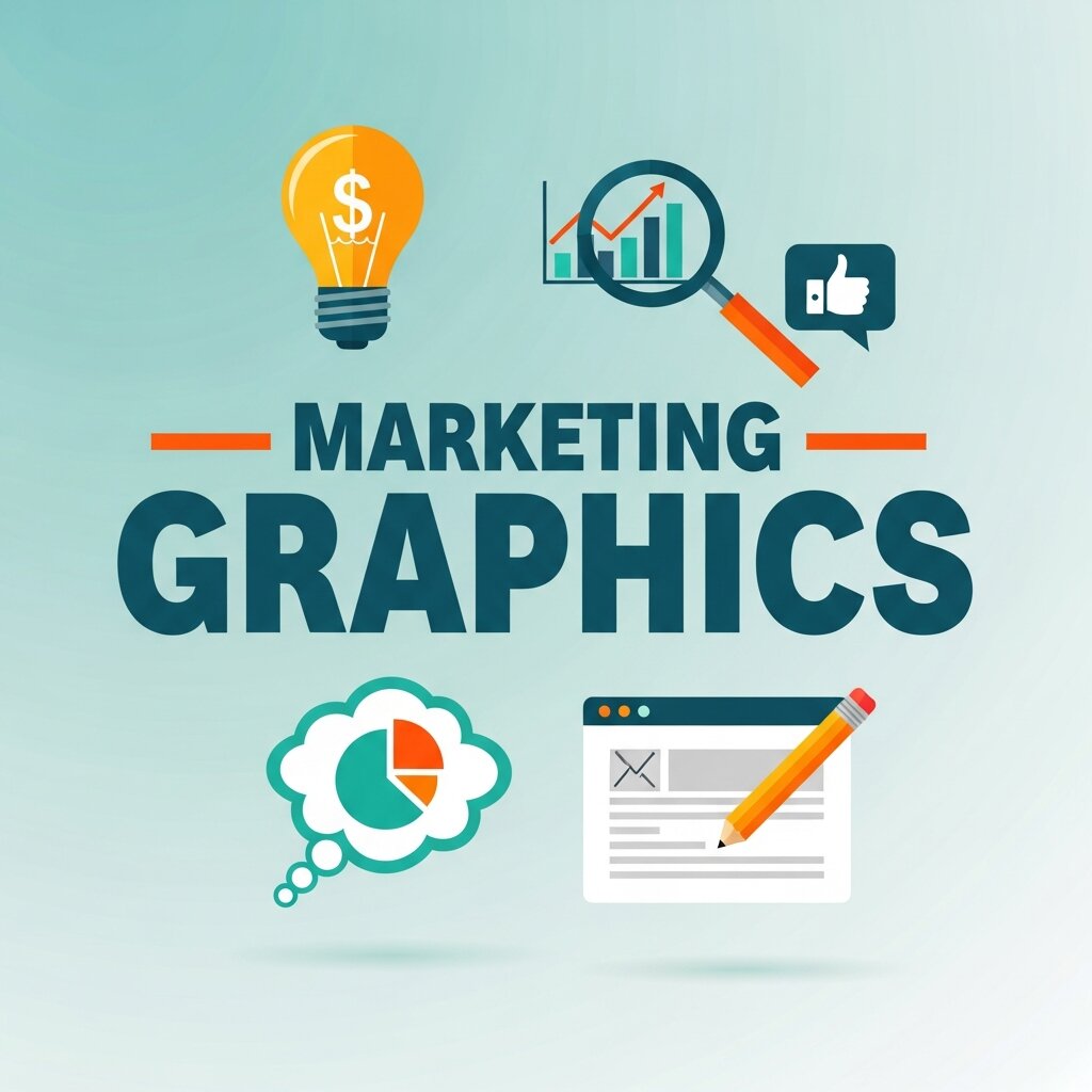
Strong marketing graphics do more than make your brand look polished. They shape how customers perceive your business, influence purchasing decisions, and—when done right—turn casual browsers into loyal buyers. Yet many businesses treat visual design as an afterthought, something to sort out once the “real” marketing strategy is in place. That’s a costly mistake.
Visual communication design sits at the intersection of psychology and strategy. The colors you choose, the fonts you pair, the layouts you build—each element sends a signal to your audience before they’ve read a single word. Research consistently shows that people form first impressions of a website in as little as 50 milliseconds. Your marketing graphics are doing the heavy lifting in that window.
This post breaks down why marketing graphics matter more than most businesses realize, how visual design directly impacts growth, and what you can do to sharpen your visual communication strategy today.
Why Marketing Graphics Are a Growth Driver, Not Just a Design Choice
There’s a common misconception that design is about aesthetics—that it’s the creative team’s job and everyone else’s problem to ignore. But marketing graphics are a business asset, full stop. They communicate value, establish trust, and differentiate your brand in a crowded market.
Consider this: content paired with relevant visuals receives 94% more views than content without visuals. On social media, posts with images produce significantly higher engagement than text-only posts. These aren’t minor boosts—they represent the difference between a campaign that cuts through and one that disappears into the feed.
Marketing graphics also support the entire customer journey. At the awareness stage, a bold visual ad grabs attention. During consideration, infographics and product visuals help customers evaluate options. At the point of conversion, a well-designed landing page removes friction and builds confidence. Visual design isn’t a single touchpoint—it threads through every moment a customer interacts with your brand.
The Psychology Behind Effective Visual Communication Design
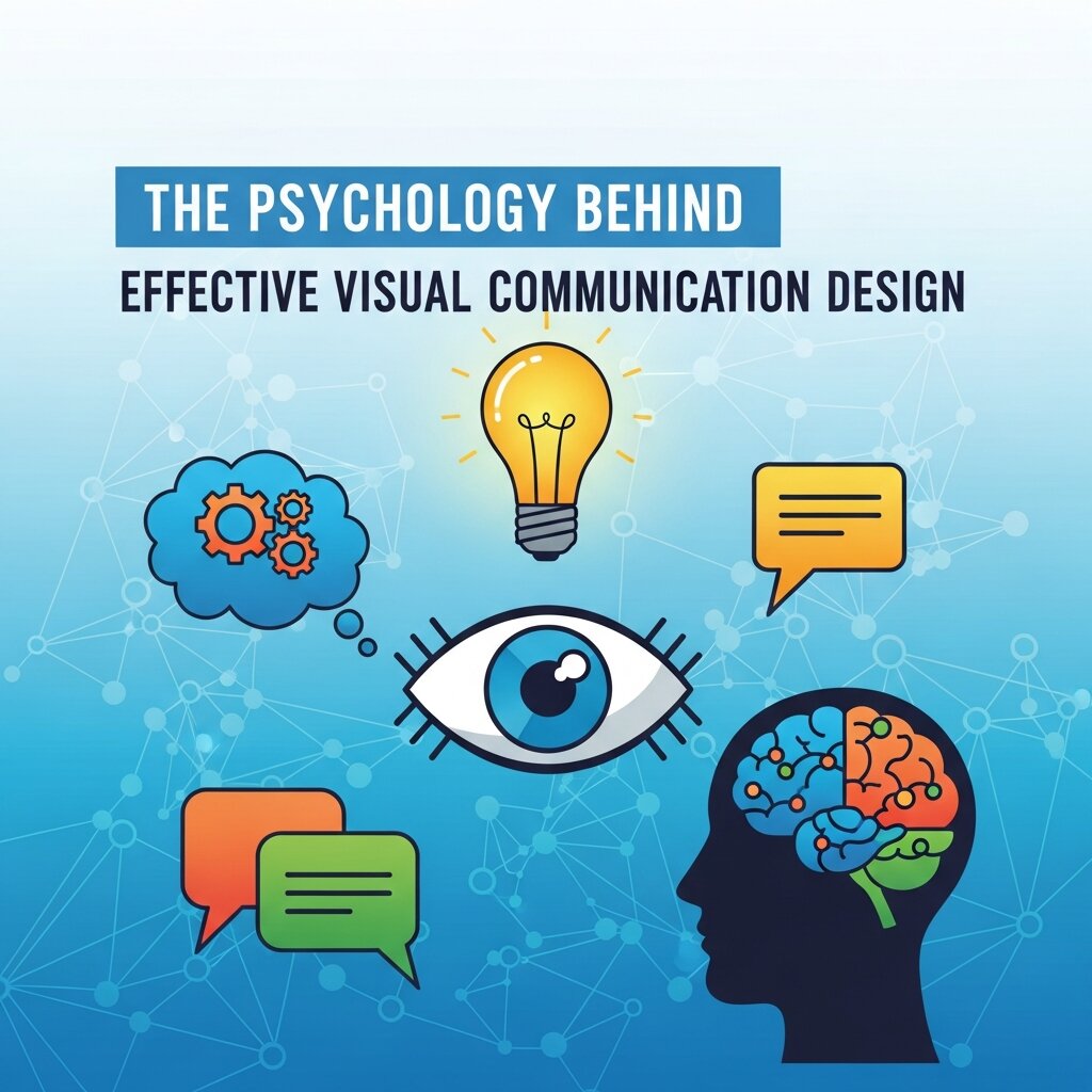 Understanding why visuals work requires a brief detour into how the brain processes information. Humans are wired to process visuals roughly 60,000 times faster than text. We absorb color before we read a word. We notice composition before we register a headline.
Visual communication design exploits these instincts intentionally. Color psychology plays a major role—blue signals trust and reliability, which is why financial institutions and tech companies lean on it so heavily. Red creates urgency, making it a staple for sale banners and call-to-action buttons. Yellow evokes optimism and energy, often used by food and lifestyle brands.
Typography follows similar logic. A serif font feels traditional and authoritative; a sans-serif feels modern and clean. The spacing, weight, and hierarchy of your text communicate tone before the reader processes the actual words.
When marketing graphics are designed with these principles in mind, they don’t just look good—they guide behavior. They lead the eye toward a call to action, reinforce brand personality, and make information easier to retain.
How Marketing Graphics Translate Into Measurable Business Results
It’s one thing to appreciate the creative merit of strong visual design. It’s another to connect it directly to revenue. Let’s look at where the impact is most tangible.
How do marketing graphics affect brand recognition and recall?
Consistent visual branding across all marketing materials increases revenue by up to 23%, according to Lucidpress. That’s because repeated visual exposure builds familiarity, and familiarity builds trust. When customers recognize your brand at a glance—through a consistent color palette, logo style, or graphic language—they’re more likely to choose you over an unfamiliar competitor.
Brand recall is closely tied to this. Studies show people remember 65% of visual content three days after seeing it, compared to just 10% of written content. Marketing graphics that align with your brand identity don’t just make a good impression in the moment—they stick.
What role does audio visual design play in modern marketing?
Audio visual design—the combination of visual and audio elements in video, motion graphics, and multimedia content—has become one of the most powerful tools in a marketer’s arsenal. Video content is projected to account for over 82% of all internet traffic, and the brands winning attention on platforms like YouTube, Instagram Reels, and TikTok are those investing in cohesive audio visual design.
Motion graphics in particular bridge the gap between static visuals and full video production. They’re cost-effective, highly shareable, and excel at explaining complex concepts quickly. An animated explainer graphic can communicate a product’s value proposition in under 60 seconds in a way that a written paragraph simply cannot match.
For businesses that haven’t yet explored audio visual design as part of their marketing mix, the opportunity is significant. Even simple animated social ads—logo reveals, kinetic typography, product demos—can dramatically outperform static equivalents.
How do well-designed landing pages improve conversion rates?
Landing page design is where visual communication directly meets revenue. A cluttered, inconsistent, or visually weak landing page creates doubt in the visitor’s mind. A clean, well-structured page with purposeful graphics moves them toward action.
Specific elements matter enormously here. White space—the empty areas around content—reduces cognitive load and directs attention. Hierarchy in typography tells visitors what to read first, second, and third. High-quality product imagery increases perceived value. A single, visually prominent call-to-action button outperforms pages with multiple competing options.
Companies that invest in professional marketing graphics for their landing pages consistently see improvements in conversion rates—sometimes dramatically so. Even small changes, like switching a button color or improving image quality, can produce measurable lifts in performance.
Building a Cohesive Visual Design Strategy
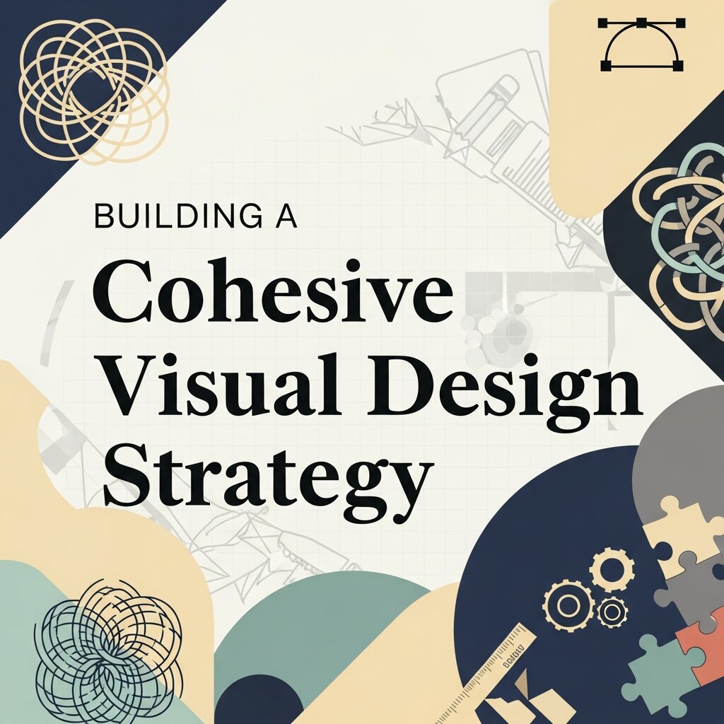 Many businesses create marketing graphics reactively—a new social post here, a fresh banner there—without a coherent visual strategy tying it all together. The result is a fragmented brand identity that confuses rather than converts.
A cohesive visual design strategy starts with a brand style guide. This document defines your color palette, typography system, logo usage rules, imagery style, and graphic treatments. It’s the foundation from which all marketing graphics are built, ensuring consistency whether a design is created in-house, by a freelancer, or by an agency.
Beyond the style guide, the most effective visual strategies are built around audience insight. Who are you designing for? What platforms do they use? What visual styles resonate with them? A B2B software company and a D2C skincare brand operate in entirely different visual registers—what works for one would likely alienate the other.
It’s also worth investing time in the right resources. Visual design books such as The Elements of Graphic Design by Alex White, Thinking with Type by Ellen Lupton, and Logo Design Love by David Airey provide frameworks that go beyond trends and build genuine design literacy within your team. Marketing professionals who understand core design principles are better equipped to brief designers, evaluate work, and make strategic visual decisions.
Common Marketing Graphics Mistakes That Undercut Growth
Even businesses with good intentions make visual design mistakes that quietly erode trust and performance. Awareness is the first step to avoiding them.
Inconsistency across channels is one of the most prevalent issues. When your Instagram visuals look nothing like your email graphics, which look nothing like your website, you create a fragmented brand experience. Customers notice, even if they can’t articulate why.
Overloading graphics with information is another pitfall. More information does not mean more value—it means more noise. Effective marketing graphics communicate one clear message per piece. If a graphic requires a paragraph of explanation to make sense, it needs a redesign.
Ignoring accessibility is both a design and an ethical failure. Low-contrast text, small font sizes, and color schemes that confuse colorblind viewers exclude a significant portion of your audience. Accessible visual design isn’t a constraint—it’s a marker of quality.
Following trends without strategic intent produces marketing graphics that feel current today and dated within six months. Trends have a place, but they should serve your brand identity rather than replace it. The businesses with the strongest visual presence are those that have developed a distinct aesthetic of their own.
Where to Focus Your Visual Design Investment
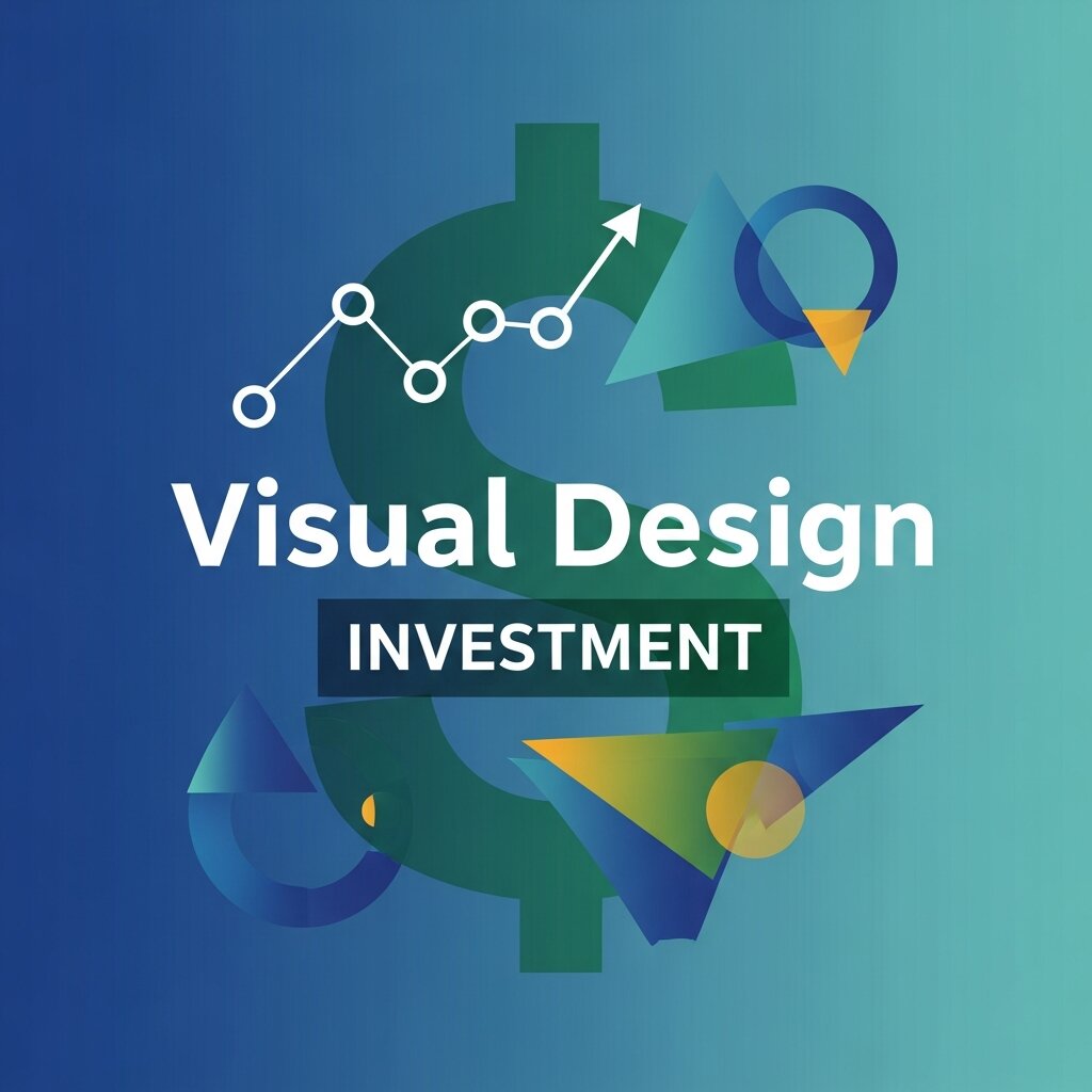 Not every business has the budget for a full in-house design team, but every business can make smarter visual design decisions with the resources available. Start by auditing your existing marketing graphics. Are they consistent? Do they reflect your brand values? Are they performing—driving clicks, engagement, conversions? Identify the weakest points and prioritize them.
For most businesses, the highest-return investments in visual design are a professional logo and brand identity system, well-designed website and landing pages, and a library of reusable social media templates. These assets form the backbone of your visual presence and pay dividends across every campaign you run.
If budget allows, incorporating audio visual design—even at the level of simple motion graphics for social ads—can meaningfully increase reach and engagement. Tools like Adobe After Effects, Motion Array, and Canva’s animation features have made entry-level motion design accessible to teams without specialist skills. Finally, take the time to learn. Visual design books, online courses, and design community resources like Behance and Dribbble give marketers a deeper appreciation of what makes graphics work—and what doesn’t.
Frequently Asked Questions (FAQs)
1. What are marketing graphics?
Marketing graphics are visual elements such as social media posts, banners, infographics, advertisements, presentations, and website images designed to communicate a brand’s message, engage audiences, and support marketing objectives.
2. Why are marketing graphics important for businesses?
Marketing graphics help businesses capture attention, strengthen brand recognition, improve customer engagement, and increase conversions. High-quality visuals also make marketing campaigns more memorable and trustworthy.
3. How do marketing graphics improve brand recognition?
Consistent use of logos, colors, typography, and design styles across all marketing channels creates a recognizable brand identity. This consistency helps customers remember your business and builds long-term trust.
4. What makes an effective marketing graphic?
An effective marketing graphic features a clear message, strong visual hierarchy, consistent branding, high-quality imagery, readable typography, and a compelling call to action. It should also be optimized for the platform where it will be displayed.
5. How does visual communication design influence customer behavior?
Visual communication design guides how people interpret information, directs attention to important content, evokes emotions through colors and imagery, and encourages users to take desired actions, such as making a purchase or signing up for a service.
6. What is the role of audio visual design in digital marketing?
Audio visual design combines graphics, animation, sound, and video to create engaging marketing content. It improves storytelling, boosts audience engagement, and helps explain products or services more effectively across digital platforms.
7. Which tools are commonly used to create marketing graphics?
Popular tools include Adobe Photoshop, Adobe Illustrator, Adobe InDesign, Canva, Figma, Adobe Express, CorelDRAW, and Affinity Designer. Motion graphics are often created using Adobe After Effects.
8. How can small businesses create professional marketing graphics?
Small businesses can use customizable templates, establish clear brand guidelines, leverage affordable design tools, and maintain consistent colors, fonts, and messaging. Investing in a professional logo and reusable templates also improves visual consistency.
9. What are the most common mistakes in marketing graphic design?
Common mistakes include inconsistent branding, overcrowded layouts, poor typography, low-quality images, weak color contrast, ignoring mobile responsiveness, and lacking a clear call to action.
10. How often should businesses update their marketing graphics?
Businesses should review and refresh marketing graphics regularly to reflect brand updates, seasonal campaigns, industry trends, and changing customer preferences. However, core branding elements should remain consistent to preserve brand recognition.
Great Visuals Are a Competitive Advantage
Marketing graphics are not decorative. They are strategic. The businesses that treat visual communication design as a core competency—investing in consistency, craft, and creativity—earn stronger brand recognition, higher engagement, and better conversion rates than those that don’t. The good news: you don’t need to overhaul everything at once. Start with a clear brand style guide. Audit your highest-traffic assets. Prioritize the visuals that directly touch your conversion funnel. Build from there.
Visual design is one of the few marketing investments that compounds over time. Every piece of well-crafted marketing graphics you create makes the next one easier, and the cumulative effect on brand trust is substantial. The question isn’t whether your business can afford to invest in visual design—it’s whether it can afford not to.


Leave a Reply