In today’s digital landscape, effective use of color theory can transform ordinary visuals into striking, memorable experiences. For graphic designers, understanding the science behind hue interactions lays the groundwork for creating cohesive brand identities, intuitive user interfaces, and immersive marketing materials. Currently, the design community faces unprecedented challenges: diverse display technologies, varying cultural interpretations of color, and rigorous accessibility requirements.
This year (2026), staying informed about best practices in palette construction and contrast evaluation is more critical than ever. In this comprehensive guide, we’ll explore foundational principles such as hue, saturation, and value; dissect color relationships that foster visual harmony; examine the emotional underpinnings of different shades; and demonstrate methods to ensure inclusive experiences for all viewers. You will also discover reputable tools and authoritative resources to support your workflow. By weaving these insights into your daily practice, you’ll gain the confidence to choose colors that resonate with audiences, reinforce brand messaging, and comply with international standards. Let’s embark on a journey through the essential aspects of color theory, equipping you with the knowledge and techniques to elevate every design project.
Understanding the Foundations of Color Theory
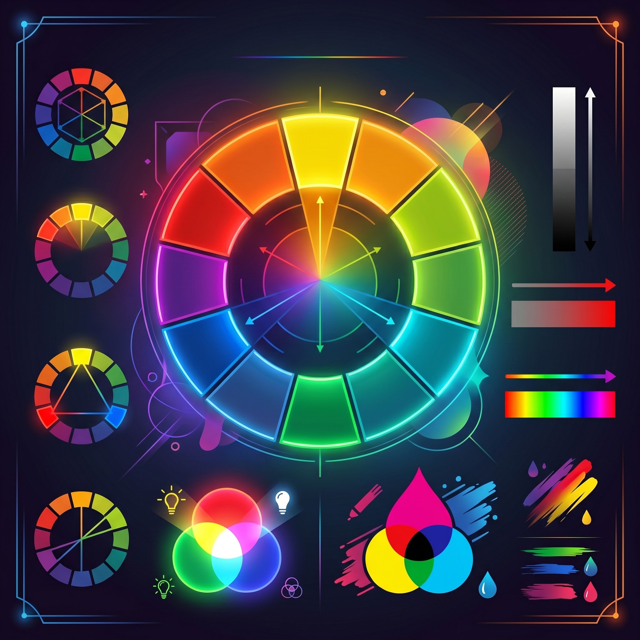
At its essence, color theory investigates how humans perceive colors and how different hues relate on the color wheel. The traditional wheel begins with three primary colors—red, blue, and yellow. When you mix these, you derive secondary colors: green, orange, and purple. Further blending yields tertiary variations like red-orange or blue-green. Beyond hue, two additional properties play a key role: saturation, which defines the intensity of a color, and value, indicating lightness or darkness. Adjusting these parameters produces tints (by adding white), shades (by incorporating black), and tones (through gray), providing designers with infinite possibilities for nuanced palettes.
This framework remains central for graphic designers crafting visual narratives. When you manipulate saturation, you control the vividness of elements; when you tweak value, you guide the viewer’s attention through light and dark contrasts. Mastery of these basics underpins every design decision, from selecting a primary brand color to fine-tuning shadow treatments in user interface components. By experimenting on the color wheel—either through hands-on exercises or digital resources like Adobe Color—you develop an intuitive understanding of how shifts in hue, saturation, and value influence mood and readability.
Working within this structure also enhances collaboration between designers and stakeholders. Clear terminology around hue, saturation, and value fosters precise feedback and streamlines approval cycles. In today’s fast-paced environment, having a shared vocabulary reduces the risk of miscommunication and accelerates project delivery. As you progress through this guide, revisit these fundamentals to ensure each color decision aligns with your overarching design objectives.
Crafting Harmonious Palettes with Color Relationships
 Developing a balanced palette hinges on establishing mathematical relationships on the color wheel, known as color harmonies. These schemes guide graphic designers in selecting sets of hues that complement each other while preserving visual appeal. Among the most popular approaches is the complementary scheme, which pairs opposite colors—such as blue and orange—for dynamic contrast. When used judiciously, this combination creates energetic compositions that draw the eye.
Analogous palettes, on the other hand, involve adjacent hues like green, blue-green, and blue. This proximity yields gentle transitions and a cohesive appearance, ideal for projects requiring a serene atmosphere. Triadic schemes expand on this idea by choosing three equidistant colors—think red, yellow, and blue—for a balanced yet vibrant look. Split-complementary palettes offer a subtler alternative to pure complementary pairing by combining a base color with the two neighbors of its opposite, softening tension while preserving contrast.
Monochromatic layouts take uniformity to the next level. By varying only saturation and value within a single hue, designers craft refined, minimalistic designs with clear hierarchies. Whether you’re defining brand guidelines, constructing web components, or designing marketing collateral, selecting the right harmony can reinforce desired emotions and guide user interactions. Tools like Coolors also allow rapid testing of multiple schemes, enabling you to visualize combinations in real time and export exact hex or RGB values for seamless implementation.
When choosing your palette, consider the context of use. Complementary schemes may excel in call-to-action buttons, while analogous options could suit background gradients. Triadic patterns often invigorate playful brands, and monochromatic sets lend sophistication to luxury goods. By experimenting with different harmonies and documenting your findings, you’ll establish a versatile color system that swiftly adapts to diverse design needs.
Psychological Impacts of Color Choices
Beyond its aesthetic function, color wields powerful psychological influence, shaping perceptions and triggering emotional responses. While reactions can vary across demographics and geographies, certain trends in human behavior have been well documented. For example, red often evokes feelings of excitement, urgency, or passion, making it a popular choice for sale announcements. Orange tends to suggest creativity and warmth, while yellow communicates optimism and draws attention. In contrast, green conveys growth, health, and tranquility, which is why you’ll frequently see it in wellness branding.
Blue, long associated with trust, calmness, and professionalism, remains a favored hue for corporate and technological enterprises. Purple, once a symbol of royalty, now signals luxury or imaginative experiences. These associations are supported by studies in cognitive psychology and marketing research, as outlined in publications hosted by the National Center for Biotechnology Information. When designing for global audiences, be mindful that color meanings can shift. For instance, white may represent purity and simplicity in Western cultures but signify mourning in some Eastern contexts.
In today’s competitive marketplace, aligning color choices with brand identity and audience expectations bolsters recall and loyalty. Before finalizing your palette, conduct user surveys or A/B tests to gauge emotional impact. Documenting these insights within your design system ensures consistency and informs future initiatives. By pairing empirical data with creative intuition, graphic designers can harness the full potential of color psychology to craft experiences that resonate and persuade.
Ensuring Accessibility through Contrast and Inclusivity
 Inclusive design demands that your color selections deliver readability and usability for all individuals, including those with visual impairments. Approximately one in twelve men and one in two hundred women experience some form of color vision deficiency. To accommodate diverse needs, follow the Web Content Accessibility Guidelines (WCAG) published by the World Wide Web Consortium. These standards specify minimum contrast ratios to ensure text and graphical elements remain legible.
Under WCAG’s AA level, normal text requires a 4.5:1 contrast ratio against its background, while large text (18pt or 14pt bold) needs at least 3:1. For AAA compliance, these thresholds rise to 7:1 and 4.5:1 respectively. Employ tools like the WebAIM Contrast Checker or plugins from popular design platforms to validate your choices instantly. Beyond ratio checks, consider color-blind simulations provided by plugins such as Stark for Sketch and Figma, helping you identify problematic color pairings early in your workflow.
High-contrast palettes not only support accessibility but also enhance focus and hierarchy in your designs. By emphasizing primary content with distinct hues and relegating secondary information to more muted tones, you guide users through interfaces effortlessly. Document all contrast validations within your style guide, ensuring developers and future team members understand rationale and requirements. In today’s market, demonstrating a commitment to accessibility not only widens your audience but also aligns with legal requirements and ethical best practices.
Implementing Practical Tools and Techniques
Leveraging the right tools can streamline your approach to color management and exploration. Popular web-based resources like Adobe Color offer interactive color wheels, harmony rule presets, and options to extract palettes from uploaded images. If you prefer desktop applications, integrated features in Sketch, Figma, and Adobe Illustrator allow you to save swatches, generate gradients, and test accessibility settings without leaving your design file.
For rapid experimentation, Coolors provides one-click palette generation, while AI-driven platforms like Colormind analyze patterns from thousands of images to suggest harmonious schemes. Many of these tools export style tokens in HEX, RGB, and CMYK formats, ensuring seamless handoff to developers and print vendors. To maintain consistency, document your finalized palette within a design system framework—specifying primary, secondary, neutral, and accent colors—complete with usage guidelines and code snippets.
In addition to software, analog methods like physical swatch books and lightbox testing remain relevant, especially when preparing materials for print. Different lighting conditions can alter perceived hues, so reviewing samples under both daylight and artificial illumination helps you anticipate real-world outcomes. Finally, establish a feedback loop: share early prototypes with stakeholders, conduct user sessions, and refine color selections based on empirical observations. By combining structured tool usage with real-world validation, you’ll uphold both creative vision and functional excellence in your projects.
Advanced Color Systems in Modern Graphic Design
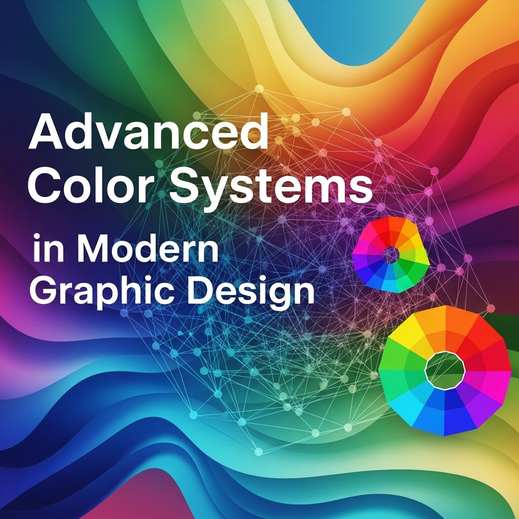 Modern graphic design increasingly relies on structured color systems to maintain consistency across large-scale projects and multi-platform branding. Instead of choosing colors manually each time, designers now build scalable systems using design tokens, variables, and digital style guides. These systems define primary, secondary, and neutral palettes along with semantic meanings such as success, warning, or error states. This approach ensures that colors remain consistent across websites, mobile apps, and marketing materials. Tools like Figma and design system frameworks help teams synchronize color usage between designers and developers. In 2026, advanced workflows also integrate dynamic color modes, such as light and dark themes, which automatically adjust contrast and readability. By adopting structured color systems, organizations reduce inconsistencies, speed up production, and create more cohesive user experiences across all digital touchpoints.
Cultural and Global Interpretation of Color
Color perception is not universal—it varies significantly across cultures, regions, and historical contexts. A color that represents positivity in one culture may carry completely different meanings elsewhere. For example, white is often associated with purity and simplicity in Western design, while in some Eastern cultures it symbolizes mourning and remembrance. Similarly, red can signify luck and celebration in certain Asian traditions but may represent danger or urgency in other regions. Graphic designers working on global brands must therefore consider cultural sensitivity when selecting palettes. Researching target audiences and testing designs in multiple markets helps avoid misinterpretation and ensures messaging remains effective. In international marketing campaigns, adaptable color systems allow localized variations while preserving core brand identity. Understanding these cultural nuances is essential for creating inclusive and globally relevant visual communication.
Future Trends in Color Theory and Digital Design
The future of color theory in graphic design is being shaped by emerging technologies such as artificial intelligence, augmented reality, and adaptive interfaces. AI-powered tools are now capable of generating optimized color palettes based on user behavior, emotional targeting, and accessibility standards. These systems continuously learn from design data, offering smarter recommendations over time. In augmented and virtual reality environments, color must adapt dynamically to lighting conditions, depth perception, and spatial context, creating new challenges for designers. Additionally, personalized user interfaces are becoming more common, where color schemes adjust automatically based on user preferences or environmental factors like brightness and time of day. Sustainability is also influencing color choices, with brands opting for eco-conscious palettes that reflect environmental responsibility. As these innovations evolve, designers must stay flexible, continuously learning and adapting their approach to remain relevant in a rapidly changing digital landscape.
Frequently Asked Questions
What is color theory in graphic design?
Color theory in graphic design is the study of how colors interact, combine, and influence visual perception. It helps designers create balanced, appealing, and effective visuals using principles like hue, saturation, value, and color harmony.
Why is color theory important for designers?
Color theory is important because it helps designers communicate emotions, guide user attention, and build strong brand identities. It also improves readability, usability, and overall visual impact in both digital and print design.
What is the difference between hue, saturation, and value?
Hue refers to the pure color on the spectrum, saturation measures its intensity or purity, and value indicates the lightness or darkness of the color. Adjusting these parameters helps designers create tints, shades, and tones for varied visual effects.
How can I test if my color palette meets accessibility standards?
Use tools like the WebAIM Contrast Checker or built-in accessibility plugins in Sketch and Figma. Ensure your color combinations meet WCAG AA or AAA contrast ratios and simulate color-blind conditions to catch potential issues early.
Which color harmony should I choose for my project?
It depends on your design goals. Complementary schemes offer high contrast for calls to action, analogous palettes create smooth, calming transitions, triadic sets deliver balanced vibrancy, and monochromatic approaches lend a sophisticated, minimalist look. Experiment using tools like Adobe Color and Coolors to find the best fit.
Conclusion
Mastering color theory empowers graphic designers to deliver visually compelling, emotionally resonant, and accessible experiences. Through a solid grasp of hue, saturation, and value, you establish a foundation for deliberate palette choices. Employing color harmonies ensures balanced compositions, while insights into psychological associations guide effective messaging. Rigorous adherence to WCAG contrast standards guarantees inclusivity, and the right mix of digital and analog tools streamlines your workflow. As you integrate these principles in today’s dynamic environment, continue experimenting, gathering feedback, and refining your approach. By documenting your processes and learning from each project, you’ll cultivate a robust color strategy that stands the test of evolving design trends. Embrace the power of color theory to shape memorable user experiences and strengthen your creative impact throughout this year (2026).
Read more about this topic: Powerful Free Graphic Design Tools for Creative Projects


Leave a Reply