

Most marketing emails get ignored. Not because the offer is bad or the copy falls flat—but because the visual experience fails to earn attention in the first place. Email graphics are the difference between a subscriber who scrolls past and one who stops, reads, and clicks.
This post breaks down the most effective email graphic ideas marketers are using right now to boost customer engagement. From interactive visuals to minimalist design choices, you’ll walk away with a clear playbook for making every email you send more compelling—and more clickable.
Why Email Graphics Matter More Than Ever
Inboxes are crowded. The average office worker receives around 121 emails per day, according to Campaign Monitor. Against that backdrop, plain-text emails—while occasionally effective for certain audiences—often fail to create the kind of visual impact that drives action.
Good email graphics do several things at once. They establish brand identity, direct the reader’s eye toward the most important content, and reduce cognitive load by replacing walls of text with clean, scannable layouts. They also signal professionalism and care—two qualities that build subscriber trust over time.
Think of your email design the same way you’d approach marketing visual design or UI/UX visual design: every element should serve a purpose. Color choices, typography, image placement, and whitespace all contribute to whether a reader engages or bounces.
What Makes an Email Graphic Actually Effective?
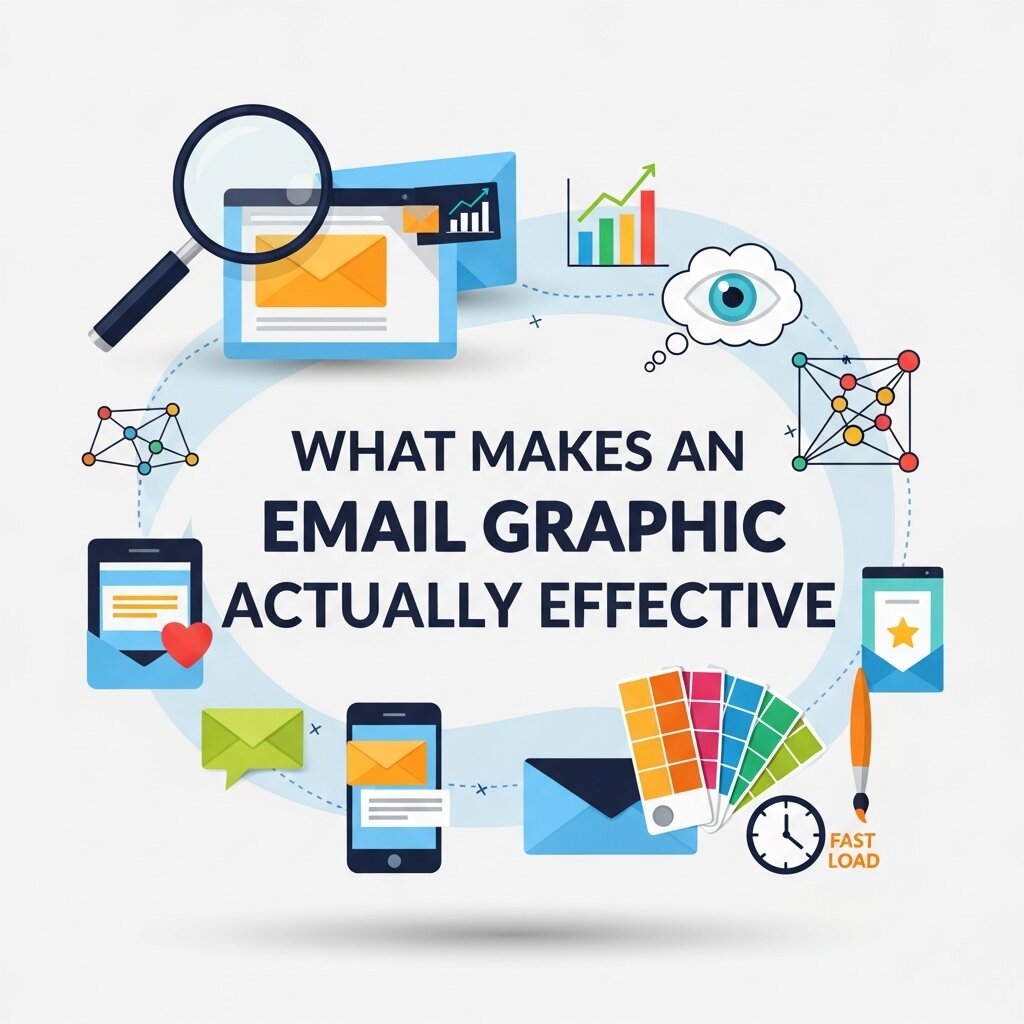 Before diving into specific ideas, it’s worth understanding the principles behind high-performing email graphics. These four factors come up repeatedly in email marketing research:
- Relevance: Graphics should reinforce the message, not distract from it. An image that has nothing to do with the email’s purpose creates confusion.
- Load speed: Heavy, unoptimized images slow down email load times and frustrate mobile users. Compress visuals without sacrificing quality.
- Accessibility: Always include alt text for images. Many subscribers read emails with images turned off by default.
- Mobile optimization: Over 60% of email opens happen on mobile devices. Graphics need to scale and reformat cleanly across screen sizes.
With those fundamentals in place, here are the email graphic ideas worth testing in your next campaign.
Creative Email Graphics Ideas That Drive Engagement
Use Hero Images That Reinforce Your Core Message
The hero image—the large banner image near the top of an email—is often the first thing a subscriber sees after the subject line. A great hero image doesn’t just look nice; it amplifies the email’s key message visually before the reader even gets to the body copy.
For product launches, this might mean a clean, well-lit product shot with minimal distractions. For seasonal campaigns, it could be a lifestyle image that captures the mood of the moment. The key is alignment: the hero image and the headline should feel like one unified statement.
Avoid stock photos that feel generic or overly staged. Authentic imagery—real customers, real environments, real use cases—consistently outperforms polished but hollow visuals.
Incorporate Animated GIFs to Capture Attention
Animated GIFs have become a staple in email marketing for good reason. They add motion to an otherwise static medium, which naturally draws the eye. Used strategically, a GIF can demonstrate a product feature, highlight a limited-time offer, or simply inject personality into a brand’s communication.
The most effective email GIFs are short (under 3 seconds), looped, and purposeful. Animating your CTA button, for example, can increase click-through rates by drawing attention to the action you most want readers to take. A subtle shimmer effect or a pulsing arrow is often enough to shift focus without overwhelming the design. Keep file sizes in check. GIFs above 1MB can slow load times significantly, particularly on mobile connections.
Leverage Countdown Timers for Urgency
Few email graphics trigger action as reliably as a live countdown timer. When subscribers see a ticking clock—whether it’s counting down to a flash sale, a registration deadline, or a product launch—the psychological pull of scarcity takes over.
Countdown timers are relatively easy to embed using tools like Litmus or Sendtric, and they work particularly well for e-commerce brands running time-sensitive promotions. Pair the timer with direct, action-oriented copy like “Offer ends in:” and you’ve created a compelling visual nudge that’s hard to ignore.
Design Infographic-Style Layouts for Educational Emails
Not every email is a promotion. Many brands use email to educate—sharing tips, guides, how-tos, or industry insights. For this type of content, infographic-style layouts work exceptionally well.
Rather than presenting information in paragraph form, break it into visual chunks: icons paired with short text, numbered steps with bold typography, or side-by-side comparisons. This approach borrows directly from social media graphics and marketing visual design best practices, where visual hierarchy is used to guide the reader through information efficiently. Infographic emails tend to see higher read times and stronger social shares, especially when the content is genuinely useful and well-formatted.
Personalize Graphics with Dynamic Image Content
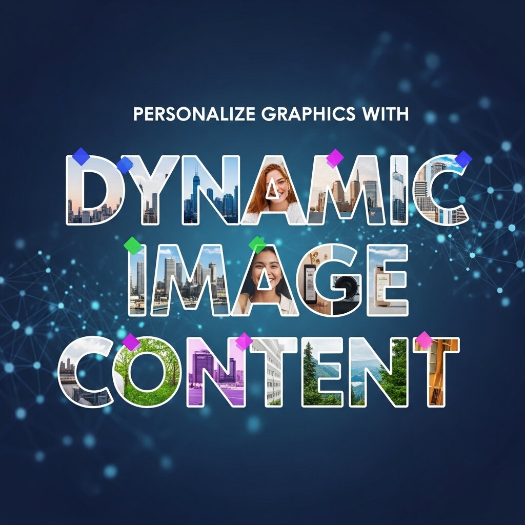 Personalization in email has evolved well beyond first-name tokens. Dynamic image personalization now allows marketers to swap out visual content based on subscriber data—showing different product images based on browsing history, displaying location-specific offers, or featuring loyalty point balances in a custom graphic.
Tools like Movable Ink and Nifty Images specialize in this kind of dynamic visual content. The effect on engagement can be substantial. Personalized emails deliver six times higher transaction rates, according to Experian—and personalized visuals amplify that effect by making the email feel tailor-made rather than mass-produced.
Use Minimalist Design to Let Your CTA Breathe
More is not always more. Some of the highest-converting email designs use generous whitespace, a single strong image, and one clearly defined call-to-action button. This approach removes visual clutter and ensures the reader’s attention flows naturally toward the desired action.
Minimalist email graphics are especially effective for premium or luxury brands, SaaS companies communicating product updates, and any scenario where clarity is more important than spectacle. If a subscriber has to hunt for the CTA, the design has failed regardless of how visually impressive it looks.
When applying this approach, think carefully about your color palette. High-contrast CTA buttons—bright on dark, or bold on neutral—consistently outperform low-contrast alternatives.
Embed Social Proof Visually
Customer reviews, star ratings, and user-generated content can all be transformed into compelling email graphics. A pull quote from a happy customer, styled as a visually distinct block, lends credibility and warmth to any promotional email.
User-generated images—photos customers have shared on social media—are particularly powerful here. Featuring real customers using your product in an email bridges the gap between social media graphics and email marketing, reinforcing brand community while giving prospects a relatable, authentic perspective.
Add Interactive Elements Where Supported
Interactive email elements—hover effects, image carousels, embedded polls, and even mini quizzes—are gaining traction among brands willing to push beyond standard email templates. When rendered correctly, these features turn passive reading into active engagement.
The caveat is compatibility: not all email clients support advanced interactivity. Apple Mail and the iOS Mail app handle interactive CSS well, while Gmail and Outlook have limitations. A progressive enhancement approach—designing for interactivity in supported clients while ensuring a clean fallback experience elsewhere—is the smartest way to deploy these features.
Align Email Graphics with Your Brand’s Visual System
Consistency matters. Every graphic you include in an email should feel unmistakably on-brand—matching the typography, color palette, and illustration style your audience already associates with you. This alignment doesn’t just look professional; it reinforces brand recognition with every send.
Consider developing a set of reusable email graphic templates that your team can customize quickly for different campaigns. This approach speeds up production, maintains visual coherence, and makes it easier to A/B test individual graphic elements without redesigning entire layouts from scratch.
Strong UI/UX visual design principles apply here: use a consistent grid, limit yourself to two or three typefaces, and establish clear visual hierarchy across all templates.
How to Test and Improve Your Email Graphics Over Time
 Great email graphics are not a set-and-forget element. The best email marketers treat their visuals as a continuous experiment. Start with A/B tests on individual elements: swap one hero image for another, test a GIF against a static image, or compare a bold CTA button color against a muted one. Most email platforms—Klaviyo, Mailchimp, HubSpot—have built-in A/B testing functionality that makes this straightforward.
Track metrics beyond open rates. Click-through rate (CTR), click-to-open rate (CTOR), and conversion rate all give you more granular feedback on how well your email graphics are performing. If a beautifully designed email isn’t converting, the design may be visually impressive but functionally misaligned with what subscribers actually want.
Heatmap tools like Litmus Analytics can show you exactly where subscribers are clicking (or not clicking), which reveals whether your visual hierarchy is guiding eyes toward the right places.
Frequently Asked Questions
1. What are email graphics?
Email graphics are visual elements used in marketing emails, including banners, product images, icons, GIFs, illustrations, infographics, and call-to-action (CTA) buttons. They help attract attention, communicate messages quickly, and encourage user engagement.
2. Why are email graphics important for email marketing?
Well-designed email graphics improve readability, strengthen brand recognition, increase click-through rates, and make marketing emails more engaging. They also help guide subscribers toward important actions such as making a purchase or signing up for an event.
3. What types of email graphics generate the highest engagement?
High-performing email graphics include hero images, animated GIFs, countdown timers, product showcases, personalized visuals, customer testimonials, infographics, and interactive design elements that support the campaign’s objective.
4. How can I optimize email graphics for mobile devices?
Use responsive images, compress file sizes for faster loading, maintain readable text, design touch-friendly CTA buttons, and test emails across multiple devices to ensure graphics display correctly on different screen sizes.
5. What image format is best for email graphics?
JPEG works well for photographs, PNG is ideal for graphics requiring transparency, SVG is suitable for simple icons where supported, while optimized GIFs are effective for subtle animations. Choosing the right format balances image quality and loading speed.
6. Should I use animated GIFs in marketing emails?
Yes, when used strategically. Animated GIFs can demonstrate products, highlight promotions, or draw attention to key messages. However, they should remain lightweight to avoid slowing down email loading times.
7. How do personalized email graphics improve campaign performance?
Personalized graphics use customer data to display relevant products, promotions, locations, or offers based on subscriber behavior. This creates a more tailored experience that often leads to higher engagement and conversion rates.
8. What are the biggest mistakes to avoid when designing email graphics?
Common mistakes include oversized image files, inconsistent branding, poor color contrast, missing alt text, cluttered layouts, unreadable typography, and graphics that fail to support the email’s primary call to action.
9. How can I measure the effectiveness of my email graphics?
Monitor metrics such as click-through rate (CTR), click-to-open rate (CTOR), conversion rate, heatmaps, scroll depth, and A/B testing results to determine which visual elements drive the best engagement.
10. How often should businesses update their email graphic designs?
Businesses should refresh email graphics regularly to reflect seasonal campaigns, product launches, branding updates, and evolving design trends. Periodic updates also help prevent design fatigue and keep subscribers engaged.
Turn Every Email Into a Visual Experience Worth Opening
Email graphics are not decoration—they’re strategy. The right visual choices can transform a forgettable email into one that drives real business outcomes, from product purchases to event registrations to renewed subscriptions.
Start by auditing your current emails. Are your hero images reinforcing your core message? Are your CTAs visually distinct and easy to find? Are you leveraging motion, personalization, or social proof in any meaningful way? Identify the gaps, apply the ideas from this post, and test systematically. The subscribers on your list have given you access to one of the most direct communication channels available. Make every send count.



Leave a Reply