

Great advertising design doesn’t happen by accident. Behind every campaign that stops someone mid-scroll or makes them do a double-take on the street, there’s a series of deliberate creative decisions—choices about color, layout, typography, and messaging that work together to create something unforgettable.
But memorable advertising is harder to pull off than it looks. Brands pour significant budgets into campaigns that fail to leave a mark, not because the message was wrong, but because the design didn’t do its job. Poor visual hierarchy, inconsistent branding, cluttered layouts—any one of these can undermine an otherwise strong idea.
This post breaks down the advertising design principles that separate forgettable campaigns from iconic ones. Whether you’re designing a full-scale digital campaign or refreshing your brand’s visual identity, these tips will help you make smarter, more impactful creative decisions.
Why Advertising Design Is the Foundation of Every Campaign
Words sell, but design gets attention first. Before a potential customer reads a single word of your copy, they’ve already formed an impression based on what they see. Research from the Missouri University of Science and Technology found that people spend an average of just 5.94 seconds looking at a website’s written content—and far less on an ad.
Strong advertising design communicates your brand’s personality, builds trust, and guides the viewer’s eye toward your most important message. Weak design, on the other hand, creates friction. It confuses, overwhelms, or simply fails to register.
The good news? Effective advertising design isn’t about having the biggest budget or the flashiest tools. It’s about understanding a core set of principles and applying them consistently across every touchpoint.
How Do You Create a Strong Visual Hierarchy in Your Ads?
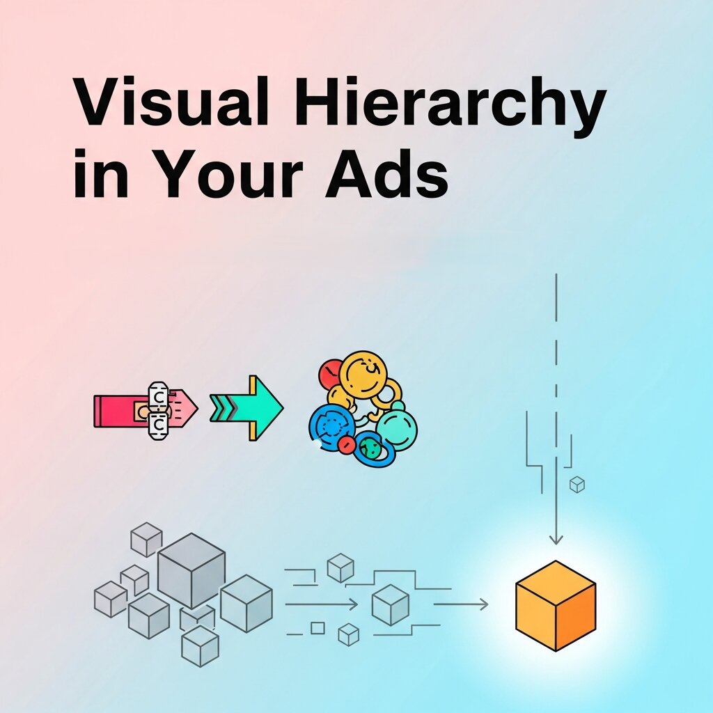 Visual hierarchy is the backbone of good advertising design. It determines the order in which a viewer processes the elements of your ad—and when done well, it guides them effortlessly from attention to interest to action.
Here’s how to build a clear visual hierarchy:
Lead with your strongest visual: Your hero image, headline, or focal graphic should immediately draw the eye. This is your hook—make it count.
Use size and weight to signal importance: Larger, bolder elements read as more important. Your headline should be significantly larger than your body copy, and your call-to-action (CTA) should stand out from both.
Create contrast between layers: Contrast—whether through color, size, or typography—helps each element of your ad occupy its own visual space. When everything competes for attention, nothing wins.
Embrace white space: Crowded layouts are the enemy of clarity. Negative space isn’t wasted space; it’s what gives your key elements room to breathe and register.
A well-designed ad should communicate its main message within two to three seconds. If a viewer has to work to understand what you’re showing them, you’ve already lost them.
What Role Does Color Play in Effective Advertising Design?
Color is one of the most powerful—and most misunderstood—tools in advertising design. It shapes perception, triggers emotional responses, and reinforces brand identity. According to a study published in the journal Management Decision, color increases brand recognition by up to 80%.
When developing your color strategy, consider:
Brand consistency: Your ad colors should align with your broader brand palette. A consistent color system is one of the simplest creative design solutions for building recognition across multiple campaigns and channels.
Emotional associations: Colors carry psychological weight. Blue signals trust and stability—which is why it’s used heavily in finance and tech. Red creates urgency and excitement, making it a staple in retail and food advertising. Yellow evokes optimism and energy.
Contrast for readability: High contrast between your text and background isn’t just aesthetically important—it’s functional. Low contrast reduces readability and accessibility, which can significantly impact campaign performance.
Cultural context: Color meanings vary across cultures. If you’re running global campaigns, research how your chosen colors are perceived in each target market before finalizing your palette.
A common mistake in digital graphic design is using too many colors in a single ad. Limit your palette to two or three primary colors per execution to maintain visual cohesion and avoid overstimulating the viewer.
How Does Typography Affect the Impact of Your Advertising?
 Typography does far more than display your words—it communicates tone, builds hierarchy, and contributes to your brand’s visual personality. The font you choose tells a story before a single word is read.
A few key principles:
Match your typeface to your brand tone: A luxury brand would never use Comic Sans. A children’s toy company probably shouldn’t use a condensed gothic serif. Your typography should feel like a natural extension of your brand’s character.
Limit your typefaces: Using more than two or three fonts in a single ad creates visual noise. Typically, one typeface for headlines and one for body copy is sufficient—and often preferable.
Optimize for legibility at scale: Advertising design spans everything from a 300×250 pixel banner to a 40-foot billboard. Choose fonts that hold up at both ends of that spectrum. Thin, decorative scripts may look elegant in print but become illegible at small sizes.
Use typographic contrast intentionally: Varying font weight, size, and casing creates visual interest and helps guide the reader’s eye. A bold headline paired with lighter body copy is a classic combination for a reason.
What Makes Digital Graphic Design Different from Print Advertising?
The shift toward digital channels has fundamentally changed how advertising design functions. UI/UX visual design principles—traditionally associated with web and app interfaces—now play a central role in how digital ads are created and evaluated.
In digital advertising, design must account for:
Motion and interactivity: Digital formats allow for animation, video, and interactive elements that static print cannot. A well-timed micro-animation can dramatically increase engagement, but overuse creates distraction.
Screen size variability: Your ad may be seen on a 27-inch desktop monitor, a mobile phone, or a tablet. Responsive design thinking—the same principle behind UI/UX visual design—ensures your creative adapts across devices without losing its impact.
Platform-specific formats: Instagram Stories, Google Display, LinkedIn sponsored content—each platform has its own dimensions, safe zones, and behavioral norms. An ad designed without these parameters in mind risks being cropped, cut off, or ignored entirely.
Faster consumption: Users scroll faster on digital platforms than they flip pages in a magazine. Your digital graphic design needs to communicate instantly. Lead with your visual hook, follow with a concise message, and make your CTA unmissable.
Accessibility: Good digital advertising design is inclusive. Use sufficient color contrast, readable font sizes, and alt text for images to ensure your campaigns reach the broadest possible audience.
How Can You Use Imagery and Photography to Strengthen Your Campaigns?
Imagery is often the first—and most memorable—element of any ad. The right visual can communicate emotion, context, and brand identity in a single frame.
Be specific over generic: Stock photography has its place, but overused images (the handshake, the smiling team, the generic laptop shot) dilute brand distinctiveness. Invest in original photography or select stock images that feel authentic and specific to your message.
Use imagery that reflects your audience: People connect with what they recognize. If your target audience doesn’t see themselves represented in your creative, they’re less likely to engage with it.
Maintain a consistent visual style: Your photography style—lighting, color grading, composition, subject matter—should be consistent across your campaign. Consistency is one of the most effective creative design solutions for building brand recognition over time.
Prioritize quality: Low-resolution, poorly lit, or visually inconsistent imagery signals low production value, which reflects directly on your brand.
Why Consistency Across Campaign Touchpoints Is Non-Negotiable
A campaign rarely lives in just one place. It spans social media, display advertising, email, out-of-home, and more. Each touchpoint is an opportunity to reinforce—or undermine—your brand message.
Visual consistency across all these formats does several things simultaneously. It builds familiarity, which increases trust. It reinforces your message through repetition. And it signals professionalism, which elevates brand perception.
Creating a campaign style guide before production begins is one of the most practical creative design solutions available to marketing teams. A style guide documents your color palette, typography, imagery style, logo usage, and spacing rules—giving every designer working on the campaign a shared reference point.
This is particularly important in digital advertising, where campaigns may be produced by multiple designers across different tools and platforms. A well-documented style guide ensures visual cohesion regardless of who creates the asset.
How to Test and Iterate Your Advertising Design
Even the most thoughtful advertising design benefits from real-world testing. What looks strong in a design file doesn’t always perform as expected in the wild.
A/B test your creative: Run two versions of an ad with a single variable changed—a different headline, color, or image—to understand what resonates with your audience. Over time, this data becomes one of your most valuable design inputs.
Track performance metrics: Click-through rate, engagement rate, and conversion rate all provide signals about how your design is performing. A low CTR on a strong offer often points to a design issue, not a messaging one.
Gather qualitative feedback: Quantitative data tells you what is happening; qualitative feedback helps explain why. User interviews, focus groups, and social listening can surface insights that analytics alone cannot.
Iterate without abandoning brand identity: Testing should refine your approach, not restart it from scratch every time. The goal is continuous improvement within a consistent brand framework.
Frequently Asked Questions (FAQs)
1. What is advertising design?
Advertising design is the process of creating visual content that communicates a marketing message and encourages a target audience to take action. It combines elements such as typography, color, imagery, layout, and branding to produce effective advertisements across print and digital channels.
2. Why is advertising design important for businesses?
Strong advertising design captures attention, communicates brand value, improves customer engagement, and increases conversions. Well-designed advertisements help businesses stand out in competitive markets while building trust and strengthening brand recognition.
3. What are the key elements of effective advertising design?
Successful advertising design typically includes a clear visual hierarchy, compelling imagery, readable typography, consistent branding, strategic color choices, concise messaging, and a strong call-to-action (CTA). These elements work together to guide viewers toward the desired action.
4. How does advertising design influence consumer behavior?
Advertising design shapes first impressions and affects how consumers perceive a brand. Effective visuals can trigger emotions, highlight product benefits, improve message retention, and influence purchasing decisions by making advertisements more engaging and persuasive.
5. What’s the difference between digital and print advertising design?
Digital advertising design focuses on responsive layouts, interactive elements, animations, and multiple screen sizes for platforms like social media, websites, and mobile apps. Print advertising design is created for physical materials such as brochures, magazines, billboards, and newspapers, where fixed layouts and high-resolution printing are essential.
6. How can businesses maintain consistent advertising design across campaigns?
Businesses can ensure consistency by developing comprehensive brand guidelines that define logo usage, typography, color palettes, imagery styles, spacing, and messaging standards. Using these guidelines across all marketing channels creates a recognizable and professional brand identity.
7. How often should advertising designs be updated?
Advertising designs should be refreshed regularly to reflect changing market trends, seasonal campaigns, audience preferences, and business objectives. However, updates should preserve core brand identity to maintain recognition and customer trust.
8. What role does A/B testing play in advertising design?
A/B testing compares different versions of an advertisement by changing one design element at a time, such as headlines, colors, images, or CTAs. The results help businesses determine which design performs better and optimize future campaigns using real performance data.
9. Can professional advertising design improve marketing ROI?
Yes. Professional advertising design improves click-through rates, customer engagement, lead generation, and conversion rates by making advertisements more visually appealing and easier to understand. Better-performing ads often lead to a higher return on advertising investment.
10. How do I choose the right advertising design service?
When selecting an advertising design partner, consider their portfolio, industry experience, creative process, understanding of your target audience, ability to maintain brand consistency, communication style, and proven success in delivering high-performing marketing campaigns across multiple platforms.
Build Campaigns That Leave a Lasting Impression
 Memorable advertising design is the product of clear thinking, disciplined execution, and a deep understanding of your audience. It’s not about being the loudest or the most elaborate—it’s about being clear, coherent, and visually compelling at every touchpoint.
Start by nailing your visual hierarchy and color strategy. Build a consistent typographic system. Align your digital graphic design with the specific behaviors and expectations of each platform. And above all, test, learn, and refine. Apply these principles consistently, and your campaigns won’t just get noticed—they’ll be remembered.



Leave a Reply