Typography is far more than choosing a pretty font. In graphic and visual design, type plays a pivotal role in conveying tone, establishing hierarchy, and guiding readers through your content. Whether you’re working on a branding project, a poster, or a digital interface, understanding the fundamentals of typography will help you craft clearer, more compelling designs. In this guide, we explore everything from the anatomy of letterforms to advanced pairing strategies and accessibility best practices. By the end, you’ll be equipped to make informed typographic decisions that elevate your work and delight your audience.
1. What Is Typography?
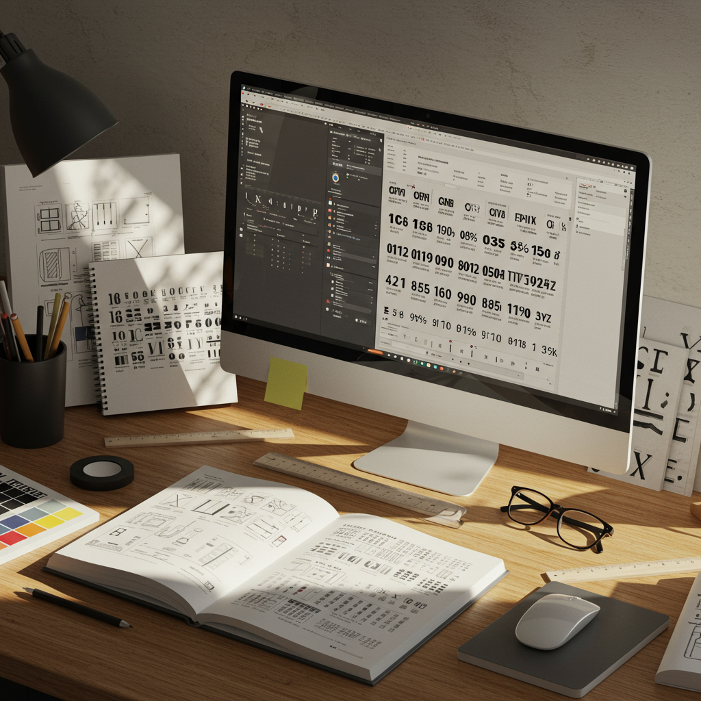
At its core, typography is the art and technique of arranging type to make written language legible, readable, and visually appealing. It encompasses font selection, point size, line length, line spacing (leading), letter-spacing (tracking), and kerning. Beyond aesthetic considerations, typography influences how readers process information, sets the emotional tone of a piece, and reinforces brand identity. Good typographic design marries form and function, ensuring clarity without sacrificing creative expression.
2. Anatomy of Type
Understanding the anatomy of letterforms helps you communicate more precisely with clients and coworkers. Key terms include:
- Baseline: The invisible line on which most letters sit.
- X-height: The height of lowercase letters, critical to perceived size and legibility.
- Serif: The small strokes at the ends of letters in serif typefaces.
- Ascender: The part of a letter that rises above the x-height.
- Descender: The portion of a letter that falls below the baseline.
Mastery of these elements enables precise adjustments and improved harmony between text and design elements.
3. Choosing the Right Font
Your font selection should align with the project’s purpose and audience. Serif fonts—for example, Times New Roman or Garamond—often convey tradition and credibility, making them ideal for editorial layouts or formal invitations. Sans-serif fonts like Helvetica or Open Sans offer a modern, clean feel suited for digital interfaces and minimalist branding. Display and script fonts can provide personality but should be used sparingly, usually for headlines or accent text. Always consider readability at various sizes, and test your choices in context before finalizing a design.
4. Font Pairing Strategies
Pairing fonts effectively creates visual interest and hierarchy. Here are three proven strategies:
- Contrast: Combine a serif headline with a sans-serif body to highlight differences.
- Superfamily Matching: Use fonts from the same superfamily (e.g., Roboto Regular and Roboto Slab) for a cohesive yet varied look.
- Mood Harmony: Pair fonts with similar moods—for instance, two geometric sans-serifs—to maintain a unified feel.
Always limit your design to two or three typefaces to avoid visual clutter and maintain consistency across your project.
5. Establishing Hierarchy
Hierarchy guides readers through content by distinguishing headings, subheadings, and body text. Techniques include:
- Size Difference: Larger type for headlines, smaller for body text.
- Weight Contrast: Bold headlines vs. regular-weight body copy.
- Color Variation: Use accent colors sparingly to emphasize key elements.
Pair these techniques to create a clear, scannable layout that directs attention in a logical order.
6. Spacing: Kerning, Tracking & Leading
Fine-tuning spacing can dramatically impact readability and aesthetic appeal:
- Kerning: Adjusts the space between individual letter pairs.
- Tracking: Uniformly alters spacing across a range of characters.
- Leading: Controls the vertical distance between lines of text.
Never rely solely on default settings; optical adjustments often yield more balanced, professional results.
7. Readability & Accessibility
Designers must ensure text is legible for all users, including those with visual impairments. Best practices include:
- Maintain sufficient color contrast between text and background (minimum 4.5:1 ratio).
- Choose fonts with open counters and clear distinctions between similar characters (e.g., uppercase I vs. lowercase l).
- Use accessible line lengths (45–75 characters per line) and generous line spacing.
Adhering to WCAG guidelines not only broadens your audience but also strengthens the professionalism of your work.
8. Typography in Branding & Identity
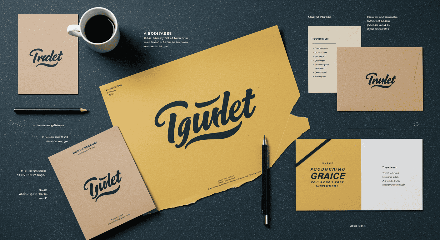
Type is a powerful brand asset. Custom typefaces or unique lettering can set a brand apart, while consistent font usage builds recognition. When developing brand guidelines:
- Select a primary typeface for headlines and key messaging.
- Choose a secondary font for body copy and supporting materials.
- Define usage rules for scale, color, and alignment.
Well-documented typography guidelines ensure consistency across print, web, and environmental graphics.
9. Common Typography Mistakes to Avoid
Even seasoned designers can fall into typographic traps. Watch out for:
- Overusing decorative fonts: Limits readability and dilutes impact.
- Ignoring alignment: Misaligned text creates visual tension and confusion.
- Inconsistent spacing: Leads to an unpolished, haphazard look.
- Too many font sizes: Breaks hierarchy and overwhelms readers.
A careful review process can catch these errors before final delivery.
10. Essential Tools & Resources
Leverage these tools to streamline your typographic workflow:
- Adobe Fonts & Google Fonts: Vast libraries of web-safe typefaces.
- Typewolf: Real-world font pairings and trend inspiration.
- FontPair.co: Curated font combination ideas.
- WhatTheFont: Identify unknown fonts from images.
Experimenting with these resources will expand your typographic palette and spark creative solutions.
Conclusion
Typography is a cornerstone of effective graphic and visual design. By understanding the anatomy of type, selecting and pairing fonts thoughtfully, refining spacing, and prioritizing readability, you create designs that communicate clearly and resonate emotionally. Whether you’re crafting a brand identity or designing a digital interface, the principles covered in this guide will help you harness the power of type. Continue to practice, explore new typefaces, and stay informed about evolving trends to keep your work fresh and impactful.
Learn more about: Mastering Grid Systems: A Complete Guide to Layout & Composition for Graphic & Visual Designers


Leave a Reply