
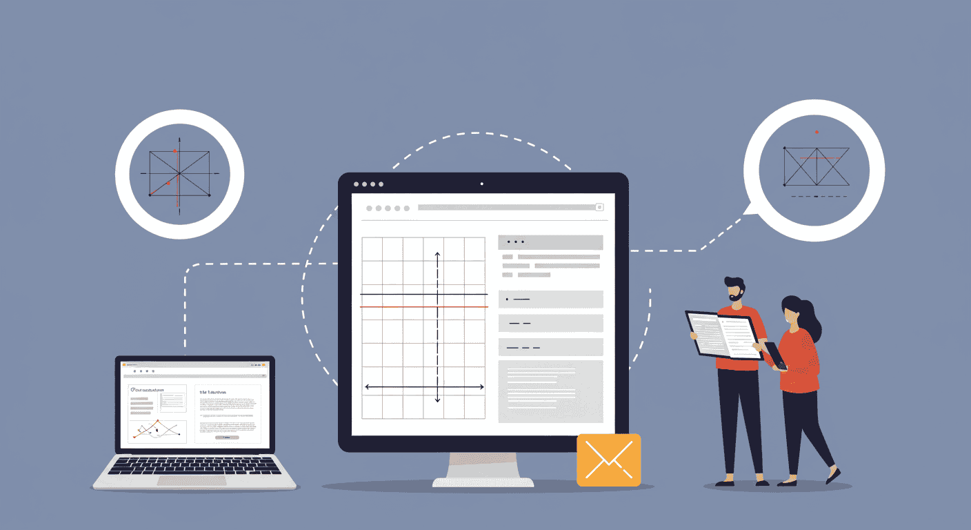
Layout and composition are fundamental to graphic & visual design. At the heart of organized, aesthetically pleasing designs lies the grid system. Whether you’re designing a website, a print publication, or a mobile app interface, understanding and harnessing grid systems can dramatically enhance the structure and readability of your work. In this comprehensive guide, you’ll explore what grid systems are, delve into their benefits, examine different types, and walk through a step-by-step process to apply them effectively. By the end, you’ll have the confidence and practical know-how to elevate your layout skills and create cohesive, visually engaging designs.
Benefits of Using Grid Systems
1. Enhanced Consistency
Grid systems enforce a structured framework that ensures consistent alignment of elements across multiple pages or screens. This uniformity builds a sense of coherence and professional polish in your designs. By placing text, images, and interactive components on predefined grid lines, you maintain a harmonious look and feel throughout your project, which is essential for branding and user experience.
2. Improved Readability
When content aligns neatly within a grid, users can follow the visual flow more naturally. Properly spaced columns and modular blocks guide the eye, making it easier to digest information. This clarity reduces visual clutter and helps your audience focus on key messages and calls to action without distraction.
3. Efficient Workflow
Designers and collaborators benefit from a shared structural language. Grids provide a reliable reference that speeds up decision-making, reduces guesswork, and simplifies hand-offs between designers, developers, and stakeholders. Reusing grid templates also means less time spent reinventing the wheel on each new project.
Types of Grid Systems
- Manuscript Grid: A single large rectangle, ideal for continuous body text in books and long articles. It provides a simple, traditional layout for text-heavy documents.
- Column Grid: Multiple vertical divisions, perfect for magazines, newspapers, and multi-column web layouts. It helps organize text and images into readable chunks.
- Modular Grid: A matrix of rows and columns that create modules. Often used in dashboards and complex interfaces to manage diverse content blocks uniformly.
- Baseline Grid: Horizontal lines that align text across columns, ensuring consistent line spacing and vertical rhythm—essential for typographic precision.
- Hierarchical Grid: An asymmetrical structure based on content importance rather than strict modules. Flexible and dynamic, ideal for creative layouts that need visual emphasis.
Principles of Effective Grid Design
- Alignment: All elements should align to a grid line, creating visual order and simplifying the eye’s movement across the page.
- Proximity: Group related items within the same grid area to signify relationships and improve scannability.
- Balance: Distribute visual weight evenly, whether symmetrically or asymmetrically, to maintain a stable composition.
- White Space: Embrace negative space to give elements room to breathe. Well-paced layouts feel more open and less cluttered.
Step-by-Step Guide to Creating a Grid Layout
- Define Canvas and Margins: Start by setting your document size and safe margins. These boundaries prevent content from touching edges and improve legibility.
- Choose Column Structure: Decide on the number of columns based on content complexity. Fewer columns suit text-heavy layouts, while more columns offer modular flexibility.
- Add Gutters and Modules: Establish consistent spacing between columns (gutters) and determine module height to maintain vertical rhythm.
- Apply Baseline Grid (Optional): For typographic projects, overlay a baseline grid to sync line heights and ensure harmonious text flow across columns.
- Place Key Elements: Pin down headers, footers, and primary content areas first. Use the grid to anchor images, text blocks, and CTAs in logical positions.
- Adjust Spacing and Scale: Fine-tune module sizes, gutter widths, and margins to balance visual weight and maintain alignment across the layout.
- Test Responsiveness: For digital projects, create nested grids or adjust column counts for tablet and mobile views. Ensure content adapts without breaking flow.
Best Practices and Expert Tips
- Start with a simple grid before introducing complexity—build up as needed.
- Use grid overlays in your design software to visualize structure as you work.
- Leverage modular scales for consistent typography and spacing ratios.
- Don’t be afraid to break the grid intentionally for emphasis or creative flair.
- Document your grid settings as reusable templates for faster project kick-offs.
- Combine different grid types (e.g., column + baseline) for advanced control.
- Review your layout at actual size and zoomed out—both perspectives reveal different alignment issues.
- Collaborate closely with developers to translate your grid into CSS frameworks or design systems.
Case Studies: Grid Systems in Action
Modern News Website: A leading publication revamped its homepage using a 12-column grid. Articles, images, and ads snapped into place, improving load speed and reader engagement. The modular grid allowed editors to rearrange stories quickly for breaking news updates.
Mobile App Interface: An e-commerce brand adopted a baseline grid combined with a 4-column layout for product listings. Consistent margins and gutters ensured a seamless shopping experience across Android and iOS, boosting conversion rates by 18% within weeks.
Conclusion
Grid systems are the unsung heroes behind smart, scalable, and visually appealing design. By mastering the principles, types, and practical application steps outlined above, you’ll gain a powerful tool for delivering professional-grade layouts in any medium. Embrace the grid, experiment with structure, and let your creativity shine within an organized framework. Your next design project will thank you for it.
Learn more about: Mastering Motion Graphics: A Comprehensive Guide for Graphic & Visual Designers


Leave a Reply