In today’s digital landscape, designing for accessibility isn’t just a nicety—it’s a necessity. Whether you’re crafting marketing materials, user interfaces, or social media graphics, ensuring your visuals are inclusive benefits everyone. This guide walks you through principles, techniques, and tools to elevate your work and make your designs more accessible.
1. Why Accessibility Matters in Visual Design
Accessibility ensures that people with visual, cognitive, or motor impairments can perceive, understand, and interact with your content. Beyond compliance with standards like WCAG (Web Content Accessibility Guidelines), inclusive design expands your audience, improves user satisfaction, and demonstrates social responsibility.
1.1 Legal and Ethical Considerations
Many regions mandate digital accessibility by law. Non-compliance can lead to legal challenges, fines, or damaged reputation. Ethically, it’s our responsibility as designers to remove barriers and enable equal access to information.
1.2 Business Benefits
Accessible designs often improve overall usability for all users. Clear layouts, strong contrast, and legible typography enhance comprehension and engagement—driving higher conversions and loyalty across demographics.
2. Color Contrast and Typography
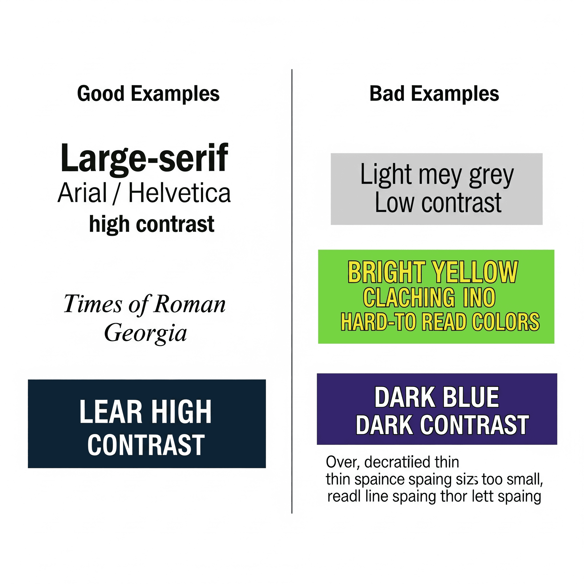
Color and type choices have the biggest impact on readability. Poor contrast or intricate fonts can alienate users with low vision or dyslexia.
2.1 Meeting Contrast Ratios
WCAG requires a contrast ratio of at least 4.5:1 for normal text and 3:1 for large text. Use online tools like the WebAIM Contrast Checker or integrated plugins in design software to verify your color combinations.
2.2 Choosing Legible Fonts
Select typefaces with open counters and distinguishable letterforms. Avoid overly decorative or condensed fonts. Aim for a minimum of 16px body text and 24px headings on web, adjusting proportionally for print.
3. Using Shapes and Icons for Clarity
Icons and shapes guide users’ attention and convey information quickly. But unclear or overly complex symbols can confuse rather than clarify.
3.1 Designing Universal Icons
Use simple, familiar metaphors (e.g., a magnifying glass for search). Ensure line weights are thick enough at small sizes, and provide descriptive labels or alt text for assistive readers.
3.2 Consistent Visual Language
Maintain consistent icon styles and color coding across your project. This consistency reduces cognitive load and helps users build a mental model of your interface.
4. Layout and Navigation Considerations
A clear, predictable layout helps all users, especially those with attention or motor challenges.
4.1 Logical Content Flow
Organize content in a meaningful hierarchy. Use headings (H1, H2, H3) in order, group related items, and avoid unintended visual jumps that disrupt reading.
4.2 Touch and Click Targets
Ensure interactive elements (buttons, links) have a minimum size of 44×44 pixels and adequate spacing. This benefits users with limited dexterity and improves mobile usability.
5. Accessible Imagery and ALT Text
Images enrich visual storytelling but can create barriers for screen reader users without proper description.
5.1 Crafting Effective Alt Text
Alt text should be concise yet descriptive. Convey the purpose or relevant content of the image. For decorative images, use empty alt attributes (alt=””) to let assistive tech skip them.
5.2 Avoiding Text in Images
Whenever possible, use live text instead of embedding text into images. Live text remains scalable, searchable, and accessible to screen readers. If text in an image is unavoidable, provide the same text alongside in HTML.
6. Tools and Techniques for Testing
Regularly testing your designs ensures accessibility issues are caught early. Combine automated checks with manual reviews for best results.
- Automated Tools: Axe, WAVE, and Lighthouse for quick scans.
- Color Blindness Simulators: Coblis, Stark plugin to view designs through different color-blind perspectives.
- Screen Readers: NVDA, VoiceOver, JAWS to experience content like visually impaired users.
- Keyboard Navigation: Tab through interactive elements to verify logical focus order and visible focus indicators.
7. Case Studies and Real-World Examples
Let’s look at how leading brands implement accessible visual design:
7.1 Microsoft Inclusive Icons
Microsoft redesigned its Fluent icons with high-contrast strokes and simplified shapes. They published guidelines and open-source libraries to help all designers adopt inclusive iconography.
7.2 GOV.UK Color Palette
The UK Government Digital Service uses a strict color palette meeting AA and AAA contrast standards. Their accessible design system provides examples and code snippets for rapid implementation.
8. Accessibility Checklist and Best Practices
- Verify color contrast ratios (4.5:1 for body, 3:1 for large text).
- Choose legible typefaces and maintain minimum size standards.
- Use clear, universal icons with descriptive labels.
- Ensure logical content order and consistent layout grids.
- Provide alt text for meaningful images; skip decorative ones.
- Test with automated tools, screen readers, and color-blind simulators.
- Enable keyboard-only navigation with visible focus states.
- Document accessibility choices in your design system or style guide.
Conclusion
Inclusive visual design isn’t a limitation—it’s an opportunity to innovate, reach wider audiences, and uphold ethical standards. By applying the principles of contrast, typography, layout, and testing outlined above, you’ll craft graphics that communicate clearly and welcome everyone. Start integrating these practices today and set your designs—and your brand—apart with true accessibility.
Ready to level up your accessible design skills? Share your favorite tools or tips in the comments below!
Learn more about: Mastering Iconography: A Comprehensive Guide for Graphic & Visual Designers


Leave a Reply