Iconography is the art of designing simple shapes and symbols that convey ideas quickly and effectively. In a digital age filled with information overload, icons serve as visual anchors that guide users through interfaces and layouts. From mobile apps to websites, from marketing materials to print design, well-crafted icons can strengthen brand identity, improve usability, and create a cohesive visual language. In this guide, we will explore the history, principles, tools, and techniques you need to master icon design and integrate icons seamlessly into your projects.
The History and Evolution of Iconography
Iconography has roots in ancient civilizations where symbols like hieroglyphics and cave paintings communicated stories and information. Over centuries, religious and cultural symbols evolved to represent complex ideas with simple images. In the modern era, the rise of printing and signage gave birth to standardized symbols for public safety and wayfinding. With the advent of digital technology, icon design has become a critical component of user interface and interaction design. Today, designers draw on this rich history to create systems of icons that are intuitive, scalable, and consistent across platforms.
Principles of Effective Icon Design
To design icons that communicate clearly, follow these core principles:
- Simplicity
- Scalability
- Consistency
- Recognizability
- Contextual Relevance
Simplicity ensures that icons remain legible at small sizes by stripping away unnecessary details. Scalability means that an icon looks crisp and balanced across different resolutions and devices. Consistency applies to stroke widths, corner radii, and grid alignment to create a unified system. Recognizability is about leveraging familiar metaphors so users understand the meaning at a glance. Contextual relevance ensures that your icons match the tone and style of the project while fitting the cultural background of the audience.
Using Grids and Alignment for Precision
A grid system is essential for precise and harmonious icon design. Establish a pixel grid based on your intended export sizes, such as 16 px or 24 px. Align shapes to the grid to avoid blurry edges and inconsistent spacing. Use consistent alignment points for key features like centers, edges, and stroke intersections. This level of precision results in icons that feel balanced and professional. Many design tools offer built-in snapping and grid customization features that streamline this process.
Choosing a Visual Style
Icons can adopt various visual styles, each with its own aesthetic and functional benefits. Some popular styles include:
- Outline icons that use strokes without fills
- Glyph icons that are solid shapes
- Flat icons with minimal detail and no depth
- Filled outline icons that combine stroke and fill
When choosing a style, consider your brand guidelines, target audience, and the context in which the icons will appear. A minimalist flat style works well for modern interfaces, while filled icons can offer stronger emphasis in navigation menus.
Color and Contrast in Icons
Color plays a crucial role in icon design, but it should be used thoughtfully. Single color icons maintain simplicity and flexibility, especially when operating within a brand palette. Multicolor icons can add vibrancy and help differentiate related functions. Whether you use one color or many, always ensure sufficient contrast between the icon and its background for accessibility and legibility. For example, a light icon on a dark background or vice versa. Use contrast checkers to verify that your color combinations meet accessibility standards. Remember that color meaning can vary across cultures, so research your audience when designing international projects.
Tools and Software for Icon Creation
Several tools can help you design professional icons efficiently. Popular options include:
- Vector editing software like Adobe Illustrator or Affinity Designer
- User interface design tools such as Sketch, Figma, or Adobe XD
- Icon-specific apps and plugins that offer grid helpers and export presets
- Open source libraries like Inkscape for a free alternative
Choose a tool that fits into your existing workflow and supports the file formats you need for web and mobile projects. Familiarize yourself with exporting settings to generate optimized SVG and PNG files.
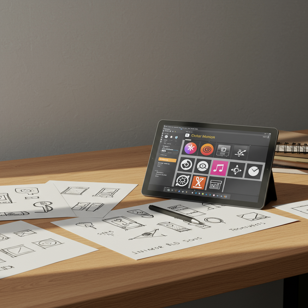
Workflow and Techniques
A structured workflow helps maintain quality and consistency. A typical process might include:
- Research and reference gathering to understand the concept and style
- Sketching rough ideas on paper to explore shapes quickly
- Vectorizing sketches in your design tool using basic shapes and Boolean operations
- Aligning elements to the grid and refining proportions
- Applying color and testing variations
- Exporting multiple sizes and formats
- Testing icons in real-world mockups and gathering feedback
By following these steps, you can iterate quickly and ensure each icon meets the design criteria before final delivery.
Accessibility Considerations
Accessible iconography ensures all users can understand and interact with your designs. Key points include:
- Ensuring clear shapes that are distinguishable at small sizes
- Providing descriptive alt text or aria labels in code
- Avoiding reliance on color alone to convey meaning
- Testing icons for color blindness and low vision
By prioritizing accessibility, you create inclusive experiences and meet legal and ethical standards in design.
Organizing and Managing Icon Libraries
Maintaining a well-organized icon library streamlines future projects. Consider these best practices:
- Use clear file naming conventions that reflect function and style
- Group icons by category and maintain consistent folder structures
- Version control your icon sets to track updates and revisions
- Document usage guidelines to ensure consistency across teams
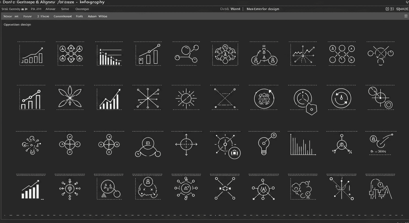
Case Studies of Icon Systems
Examining well known icon systems can inspire your work. Examples include:
- Material Design icons by Google, known for their minimal strokes and grid based precision
- Font Awesome, a versatile library that offers both outline and solid styles
- Feather Icons, a collection of open source outline icons designed for simplicity
Analyze these systems for consistency, naming conventions, and how they handle different sizes and contexts.
Best Practices for Maintaining Quality
To deliver professional icon sets, adhere to these guidelines:
- Regularly audit icons for consistency in stroke width and style
- Keep line weights and corner radii uniform across the set
- Document design decisions and maintain a style guide
- Collaborate with developers to ensure smooth integration
Integrating Icons into User Interfaces
When adding icons to interfaces, consider spacing, alignment, and interactivity. Align icons to baseline grids and text lines to maintain visual balance. Provide adequate padding around icons to create tappable areas on touch devices. Use consistent sizes for similar actions, such as navigation items or toolbar buttons. Test icons on actual devices to verify clarity and responsiveness. Combining icons with labels can improve discoverability, especially for new users. Keep the number of distinct icons manageable to avoid cognitive overload.
The Future of Iconography
Icon design continues to evolve with technology and user needs. Emerging trends include animated icons that provide feedback and micro interactions. Variable icons powered by CSS can adapt to different themes and user preferences in real time. 3D and isometric icons are gaining popularity for their depth and engaging visuals. Designers are also exploring data driven icons that change based on context or user data. Staying informed about these trends will help you create fresh and innovative icon systems in the years ahead.
Conclusion
Mastering iconography is a valuable skill for any graphic and visual designer. By understanding the history, adhering to core principles, leveraging the right tools, and following best practices for accessibility and consistency, you can create icon sets that enhance usability and brand coherence. Icon design is both an art and a science that requires continuous learning and iteration. Use this guide as a roadmap to refine your process and produce icons that communicate with clarity and impact. Start by applying these techniques to a small set of icons, gather feedback, and expand your library with confidence.
Learn more about: Mastering Visual Branding: A Comprehensive Guide for Graphic & Visual Designers


Leave a Reply