
What Is Color Theory?
Color theory is a body of practical guidance on color mixing and the visual impacts of specific color combinations. It encompasses a set of principles used to create harmonious designs and to communicate feelings or messages through color. By studying color theory, designers gain insights into how colors interact, how they can be combined to achieve balance, and how different hues can evoke various psychological responses in the viewer.
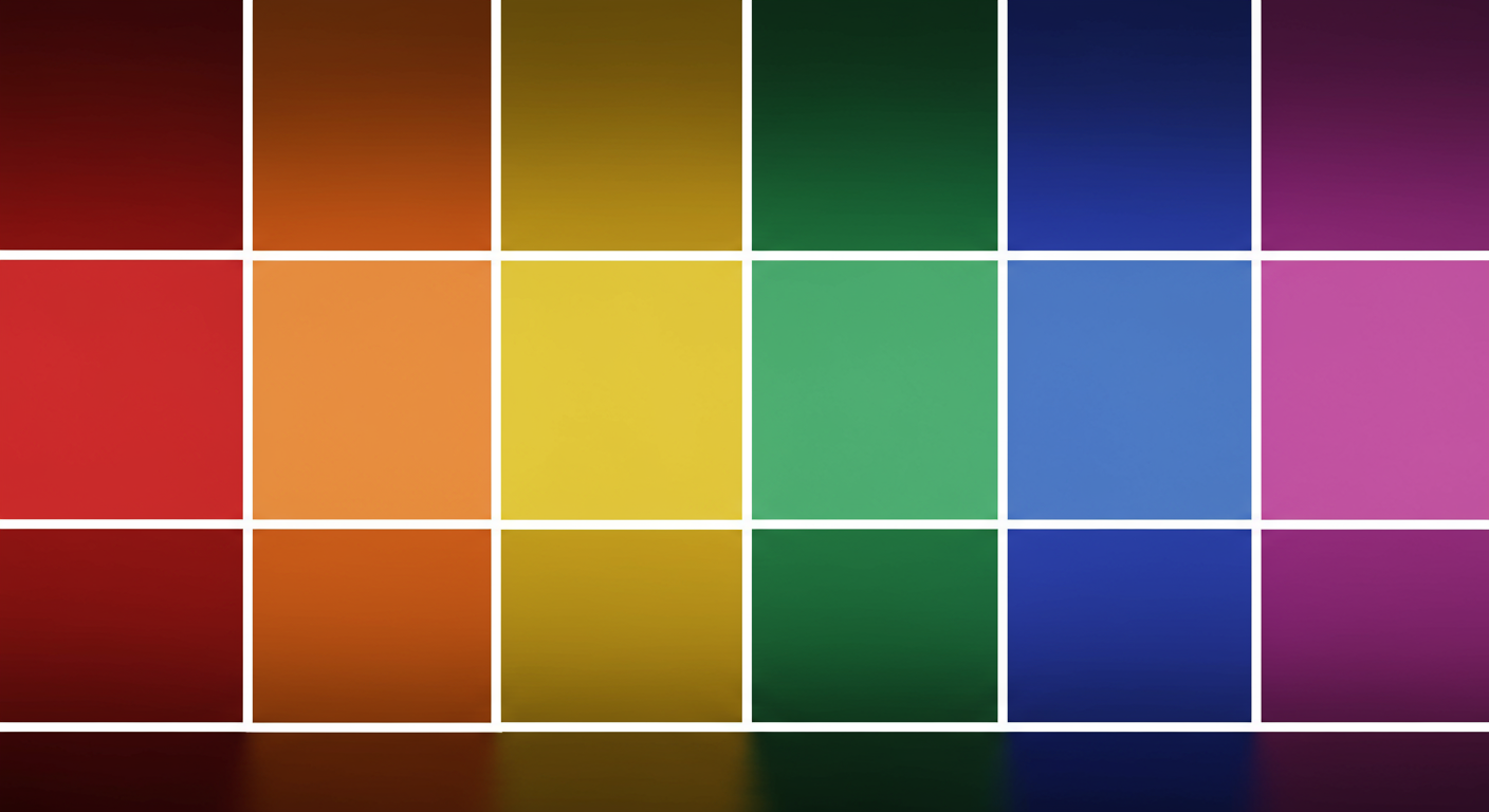
The Color Wheel and Its Components
Primary Colors
The color wheel is a visual representation of colors arranged according to their chromatic relationship. At its most basic level, it consists of three primary colors: red, blue, and yellow. These colors cannot be created by mixing other colors. They serve as the foundation for all other hues and are crucial for understanding color relationships.
Secondary and Tertiary Colors
When you mix two primary colors, you get secondary colors: green (blue + yellow), orange (red + yellow), and purple (red + blue). Tertiary colors are created by mixing a primary color with an adjacent secondary color. These intermediate hues enrich the color palette and offer more nuanced shades for more sophisticated designs.
Color Harmonies and Schemes
Complementary Colors
Complementary colors are opposite each other on the color wheel, such as blue and orange or red and green. This high-contrast combination creates vibrant and dynamic visuals. It’s perfect for call-to-action elements or to make certain design components stand out.
Analogous Colors
Analogous color schemes use colors that are next to each other on the wheel, like blue, teal, and green. These combinations are harmonious and pleasing to the eye, often found in nature. They provide a cohesive look and feel but lack the contrast of complementary schemes.
Triadic Colors
A triadic scheme uses three colors evenly spaced around the color wheel. Examples include red, yellow, and blue, or orange, green, and purple. Triadic combinations offer a balanced yet vibrant palette, making designs feel lively without overwhelming the viewer.
Color Psychology and Emotional Impact
Colors have the power to evoke emotions and influence perceptions. Warm colors, such as reds, oranges, and yellows, often convey energy, passion, and warmth. Cool colors, like blues, greens, and purples, tend to evoke feelings of calm, trust, and professionalism. Understanding the psychological effects of color helps designers choose hues that align with brand identity and project goals.
Common Color Mistakes to Avoid
- Overusing multiple colors: Too many colors can confuse the viewer and dilute brand identity.
- Ignoring cultural context: Colors have different meanings in different cultures; research your target audience.
- Relying solely on trends: While trendy palettes can be appealing, they may age quickly.
- Neglecting brand consistency: Ensure your color choices align with existing brand guidelines.
Practical Tips for Using Color in Design
- Limit Your Palette: Stick to a few key colors to maintain a clean and focused design.
- Use Contrast for Readability: Ensure that text stands out from the background by using high-contrast color combinations.
- Consider Accessibility: Check color contrast ratios to make sure your design is accessible to users with visual impairments.
- Leverage Neutrals: Incorporate neutral tones like whites, grays, and blacks to balance vibrant colors and create breathing space.
- Test With Real Content: Always test your color scheme with actual images, illustrations, and text to see how it performs in context.
Advanced Color Techniques
Explore gradient overlays, duotone effects, and color overlays to add depth and interest to your designs. These techniques can make your visuals more dynamic and modern. For instance, using a soft gradient background can guide the user’s eye, while duotone imagery can reinforce brand colors in marketing materials.
Cultural Perspectives on Color
Color interpretations can vary widely across cultures. For example, white is associated with purity in Western cultures, but with mourning in some Eastern traditions. Red symbolizes luck in China, but can represent danger in Western contexts. When designing for international audiences, consider these cultural nuances to avoid misunderstandings.
Implementing Color Across Media
Whether you’re working on digital platforms or print materials, color reproduction can differ. Screens use RGB color mode, while print relies on CMYK. Always convert your designs to the appropriate color space and perform test prints or digital proofs to ensure your colors appear as intended.
Tools and Resources
- Adobe Color: An online tool to explore color schemes and generate palettes.
- Coolors.co: A fast and easy color scheme generator with export options.
- Material Design Color Tool: A resource for creating color themes that follow Material Design guidelines.
- Paletton: An interactive color wheel for experimenting with different harmony rules.
Further Learning and Courses
- Coursera’s Graphic Design Specialization: Includes modules on color theory and typography.
- Udemy: “Color Mastery for Graphic Designers” course with practical exercises.
- Books: “Interaction of Color” by Josef Albers and “Color Systems” by Gunter Bohning.
Case Studies and Real-World Examples
Successful brands leverage color to strengthen their identity. Coca-Cola’s vibrant red communicates excitement and energy, while Facebook’s blue conveys trust and reliability. Slack’s use of a consistent color palette across its platform fosters recognition and user engagement. By analyzing these examples, you can learn how specific hues and combinations reinforce brand messaging and user perceptions.
Conclusion
Mastering color theory is a crucial skill for graphic and visual designers. By understanding the color wheel, color harmonies, and the psychology of hues, you can create designs that resonate with audiences and communicate your intended message effectively. Experiment with different palettes, use the right tools, and always keep accessibility and cultural considerations in mind. With a solid grasp of color theory and the practical techniques covered in this guide, you’ll be well-equipped to elevate your design projects and deliver impactful visual experiences.
Learn more about: Mastering Iconography: A Comprehensive Guide for Graphic & Visual Designers


Leave a Reply